

The background
The Qantas Frequent Flyer program is a loyalty program offered by Qantas airline. The program encourages airline customers to accumulate points which may then be redeemed for air travel or other rewards like retail shopping at the Qantas Rewards Store.
While the primary goal of this e-commerce project was to re-platform the website, the business also wanted to enhance the customer experience and broaden its customer base to reach non-members.
The site needed to reinforce Qantas’ core business and distinguish itself from any other Australian e-commerce retailers by emphasising their highly curated inventory presented via a world-class online experience.
UX Research methods
-

Stakeholder and user interviews.
-

Review data and analytics vs requirements and constraints.
-

Qualitative survey & field studies.
-

Support call monitoring and mind mapping.
-

Value proposition and insights into hypothesis.
-

Competitor analysis and competitive testing.
Key focus areas
Customer interviews
My goals were to test assumptions with our user personas. Via interviews I identified the main user needs that needed addressing.
The primary needs I defined were:
- Clear product organisation and catergorisation for a seamless shopping experience
- Product search to easily find products
- Helpful product suggestions that reflect Qantas expertise and curated inventory
- Customer brand relationship to establish trust
- Detailed product information to ensure product selection and reviews to help make informed buying decisions and allow for user input
- Efficient checkout process to save users time and allow for easy purchase of products
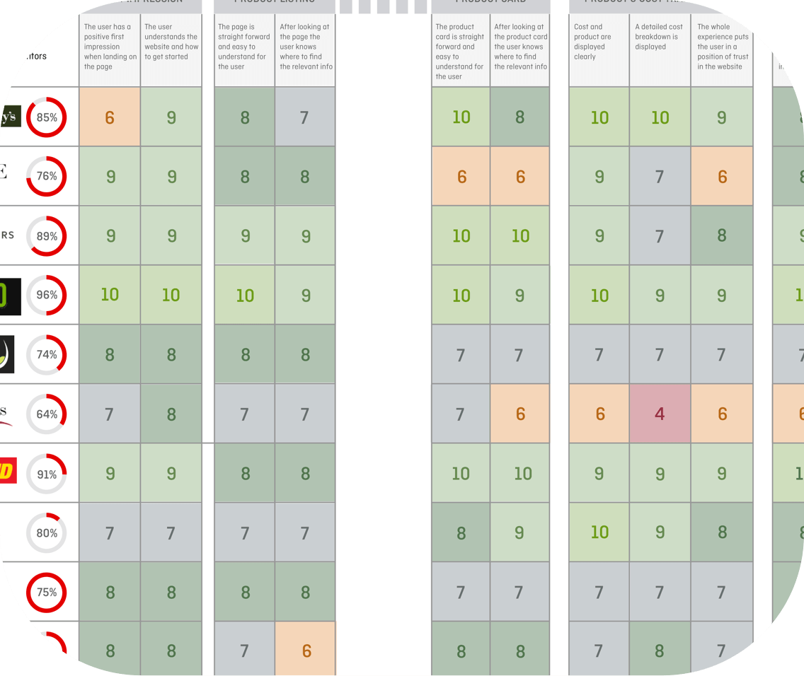
Competitive analysis
To further validate the hypotheses of our user interview findings, I began to identify competitors, specifically in the online retail area within Australia, and indirect competitors in the online wine market. The direct competitors we analysed included David Jones, Amazon, and eBay. The indirect competitors included BWS, Cellarmasters, and Vinomofo.
The main goal was to compare and identify common features across these sites and potential opportunities for Qantas Rewards Store (and Qantas Wine) to differentiate itself.
The most important takeaway from this activity was learning how different websites organised their category selection, complicated checkout processes and the overall layouts they used for those websites. This was helpful information that helped set the stage for my second phase of research.
UX Design methods
-

Created User Stories and Personas
-

Competitive and Task analysis
-

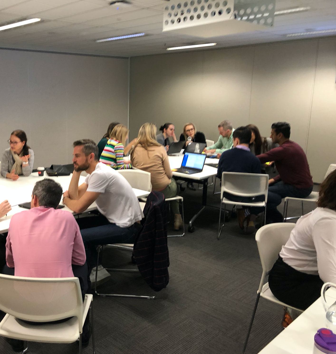
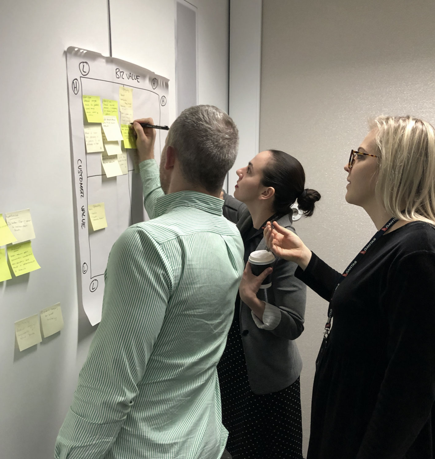
Facilitated ideation workshop using “How might we”
-

User flows and Customer journey
-

Persona building
-

Card sorting, Hand Skecthes and Wireframes
What is the customer problem I am solving?
“How might we delight people with a world class online shopping experience?”
Card Sorting
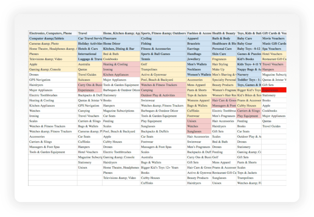
We asked 9 users to organise around 94 different product titles into categories that seemed most logical to them. They then labelled each of these groups with titles that they felt accurately described the items within the category.
The goal was to gain a further understanding of the ways in which a product on the Qantas Rewards Store website could be categorised and how these categories could be labelled.
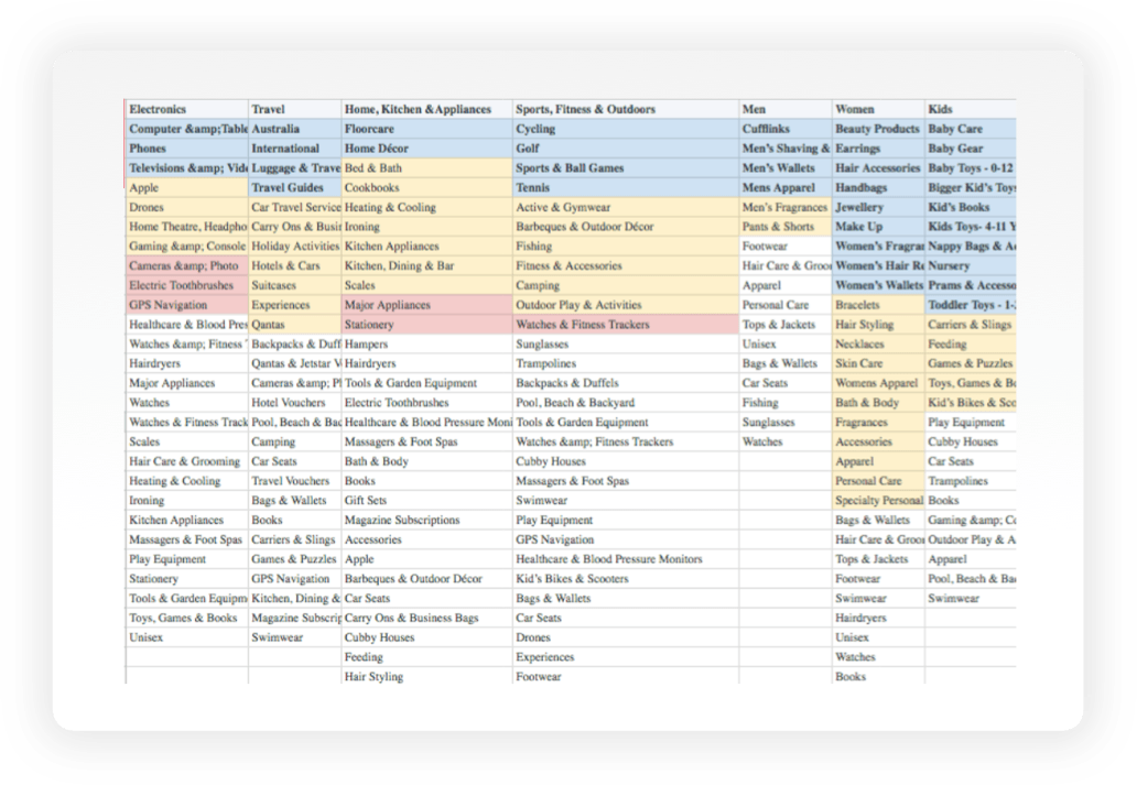
Based on the results of the users card sorting, we created 13 predetermined categories from the most common groups. We then conducted a ‘closed cart sort’ where a group of 9 different users were asked to sort the items into these predetermined categories. This helped to clarify whether the categories were logical to the majority of users, before I moved forward with my design.
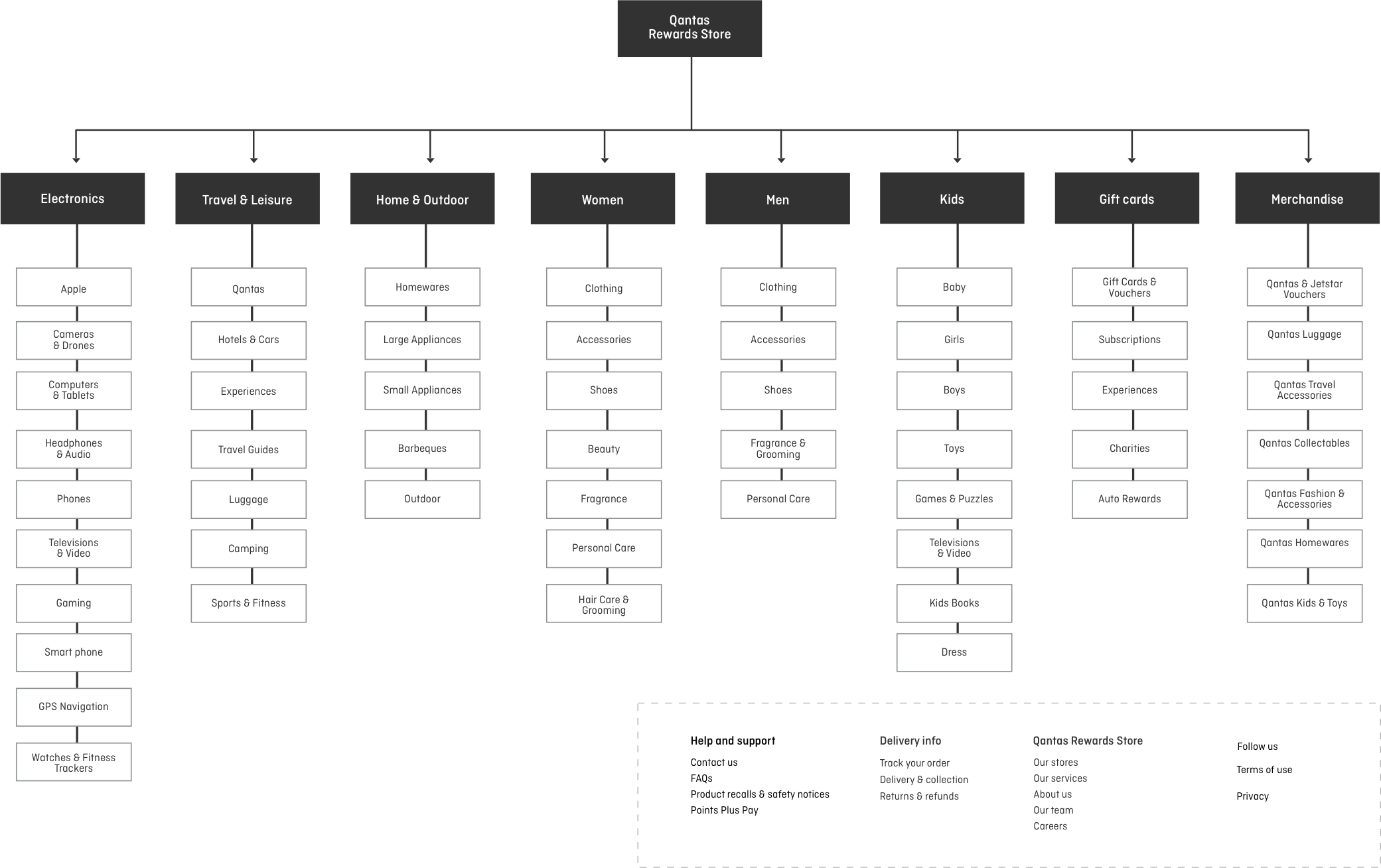
Sitemap from card sorting
With the results of the card sort, and inspiration from other competitor websites, I created a site map to define the overall structure of the website. This was to ensure that products would be placed where users would expect to find them when visiting the website, and to make the experience more intuitive.
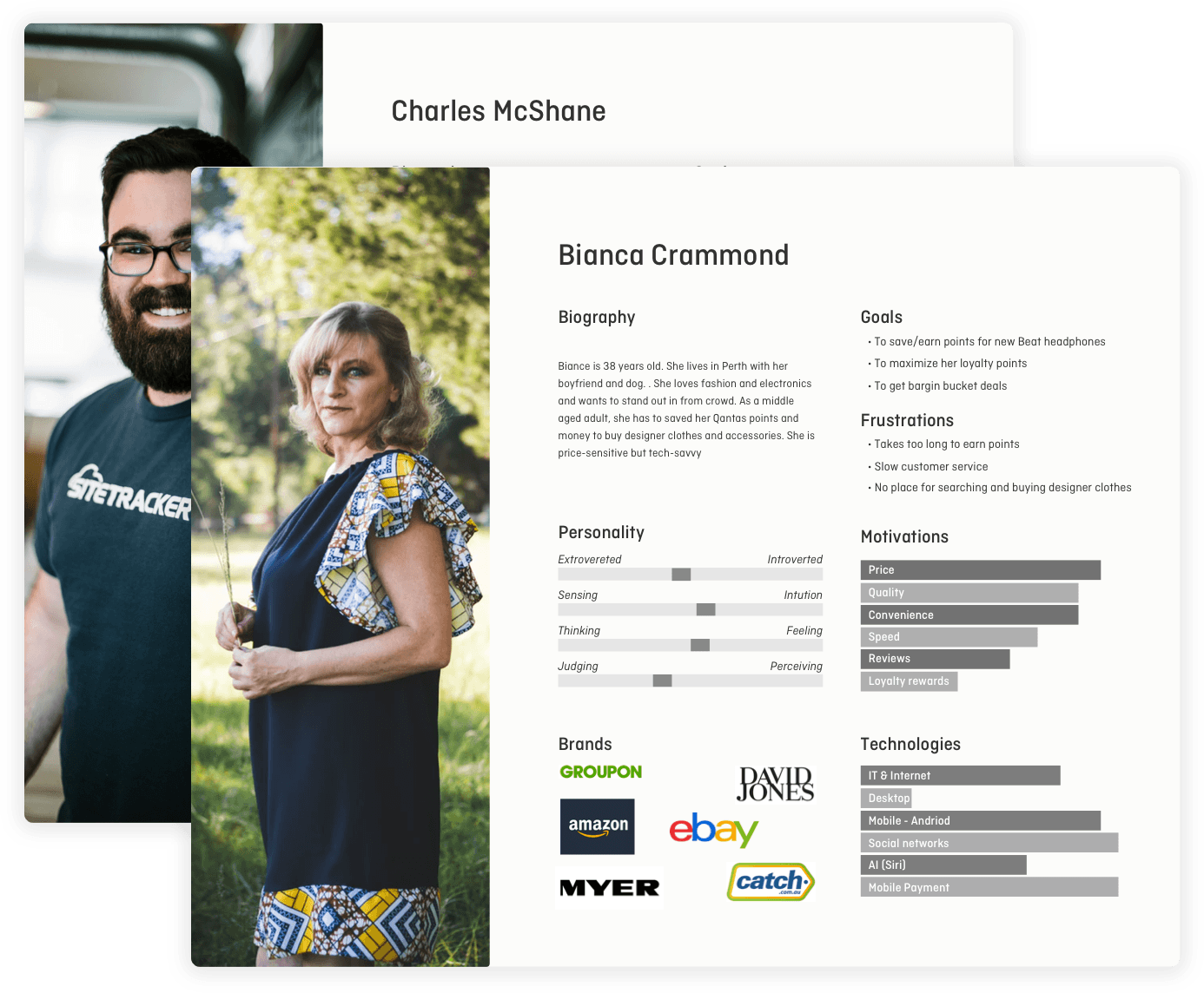
User Persona
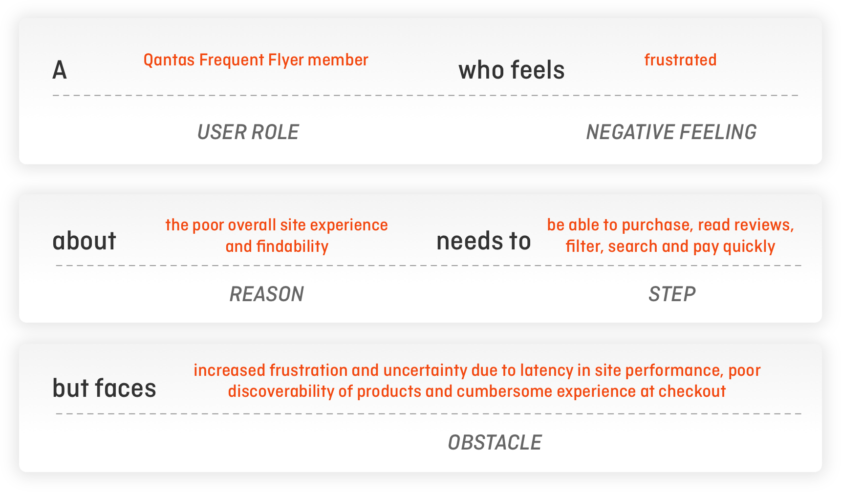
We undertook research and developed two personas to help us better understand the sites potenial users and their preferred path to purchase.
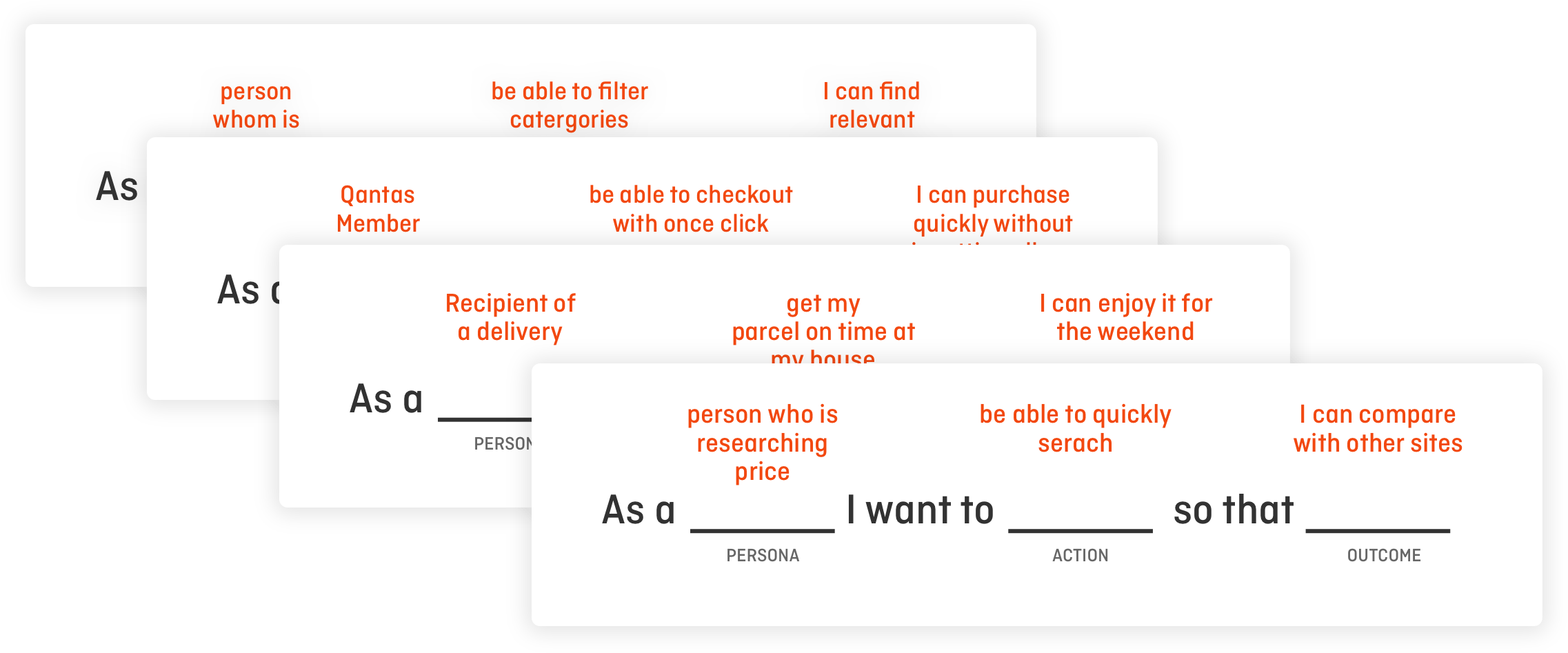
User Stories
I then created user scenarios which saw a skeleton structure emerge based on the users’ primary goals.
I was then able to create a general logic architecture that gave a wider picture of the logic process and the screens that would be required.
Hand sketched ideas
Once I had created the user stories it allowed me to develop a series of quick sketches based on users primary goals.
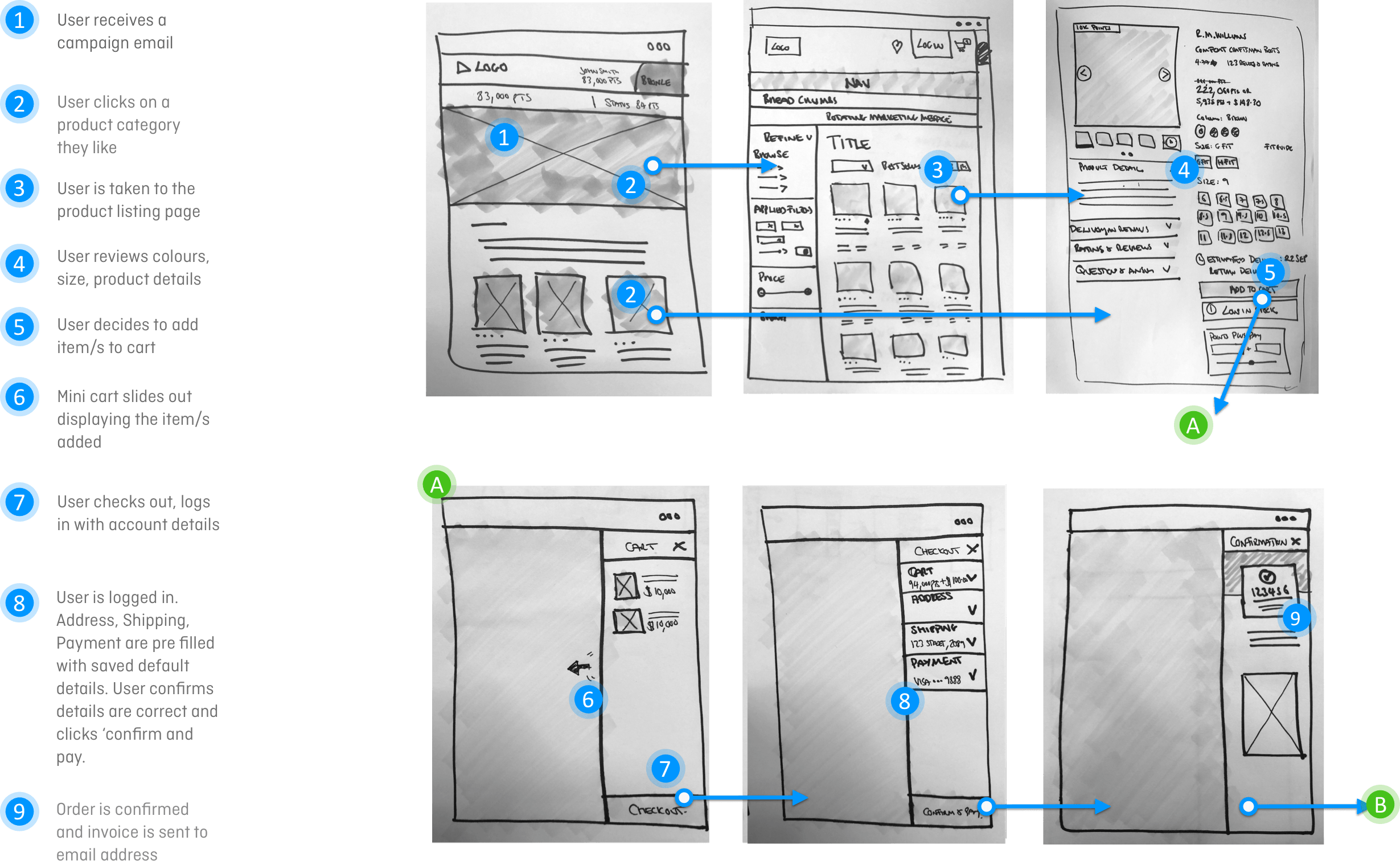
Path to purchase
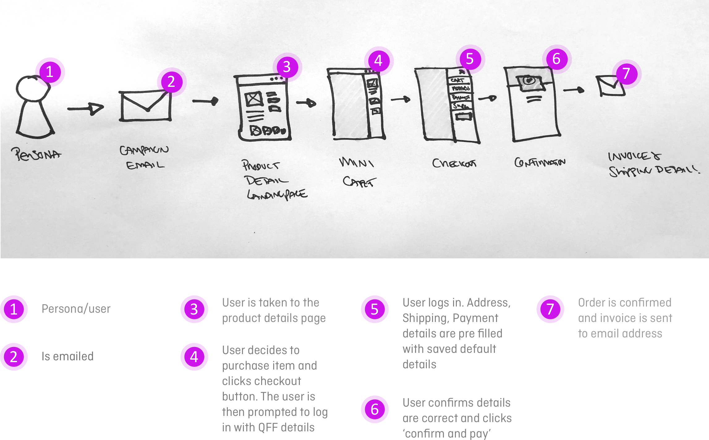
Email to checkout
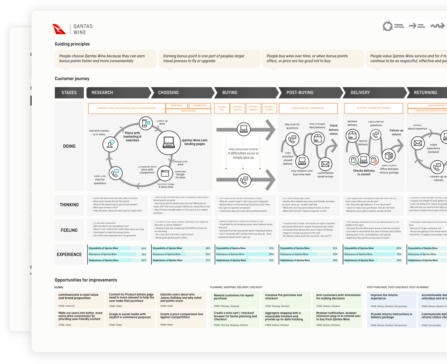
Customer Journey Map
My Customer Journey Map was aligned to my research. I used the map to mark the logical steps that users would take when they needed to report a missing/lost parcel.
I focused on the ‘Post buying’ and ‘Delivery’ stages as this was ultimately where users experienced the highest pain points.
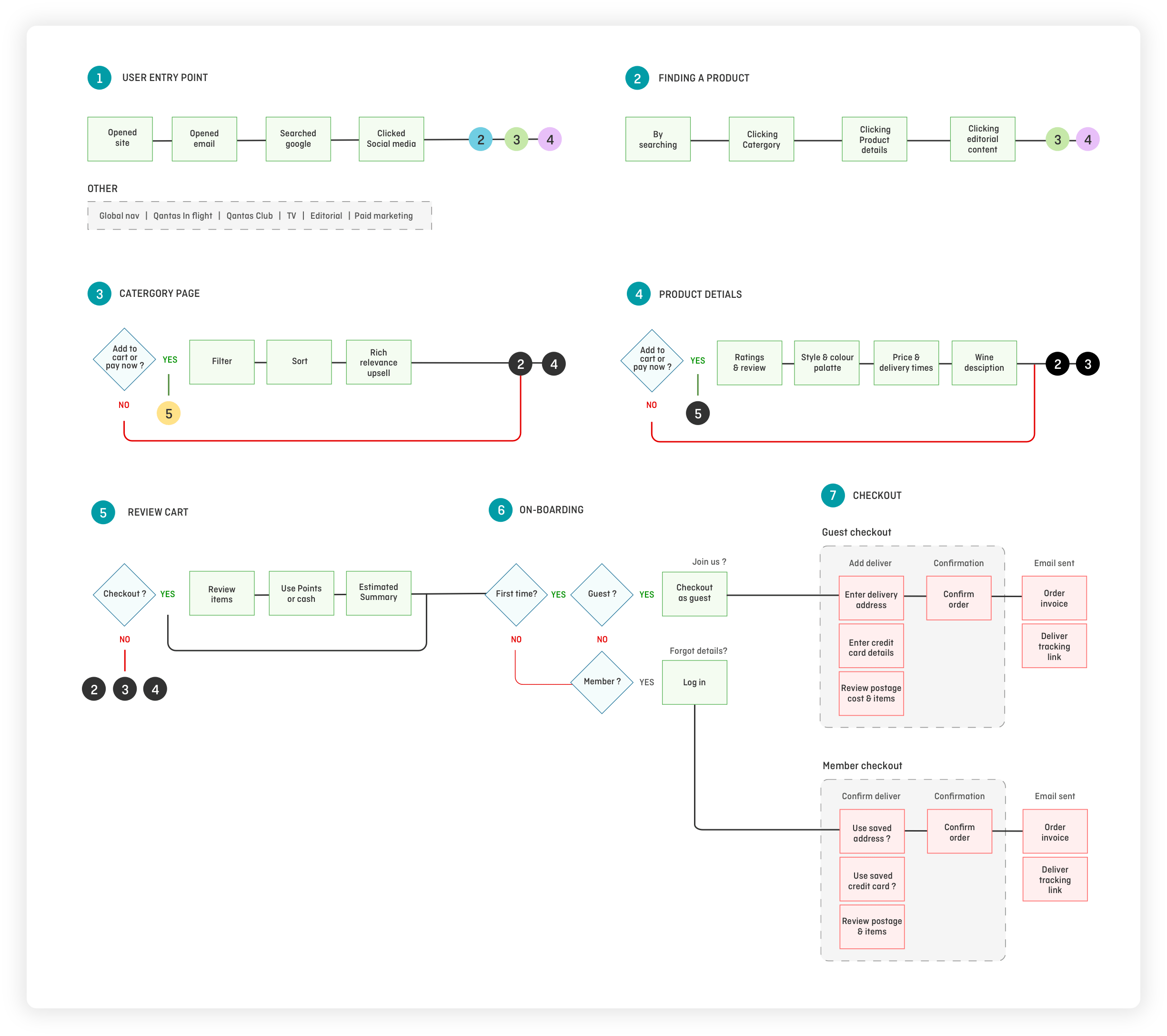
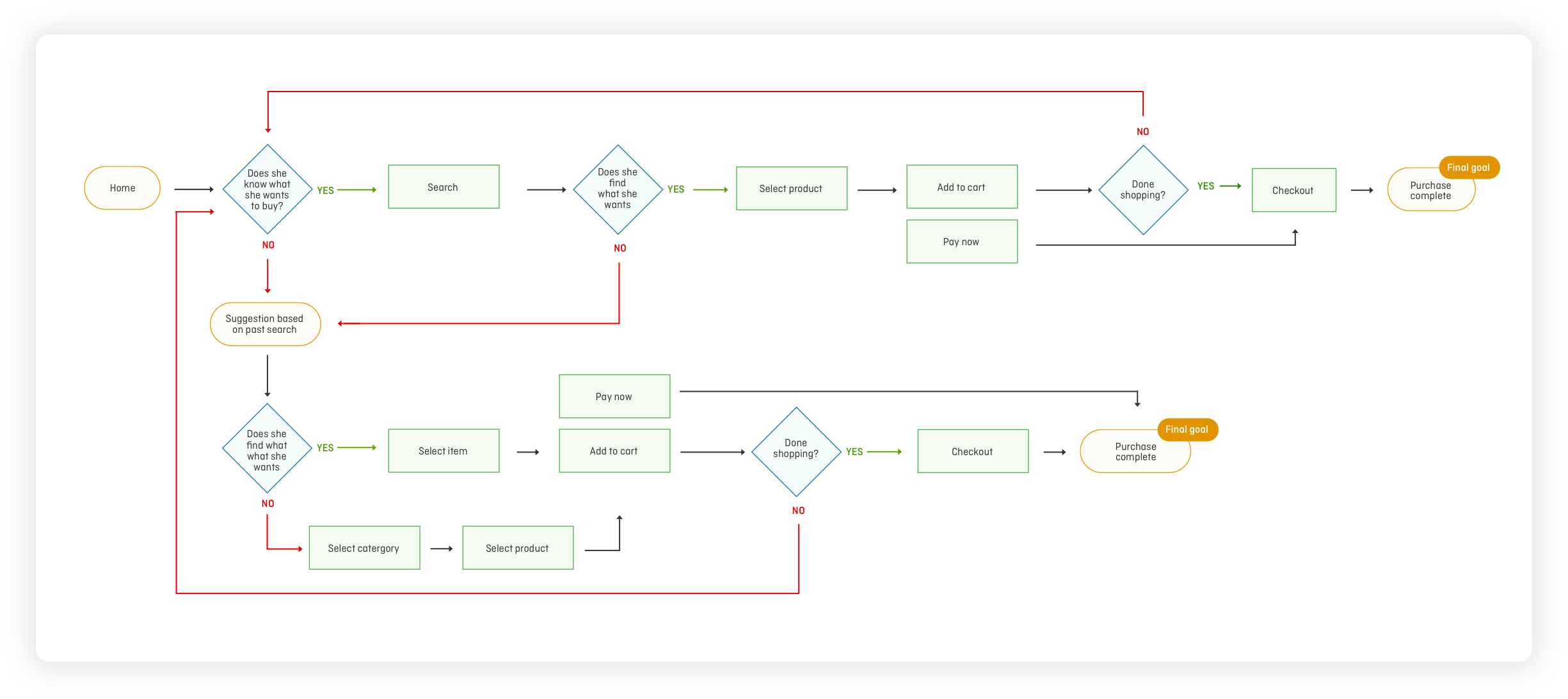
User Flows
We created User Flows for each of the personas to make the experience more specific to their goals. We wanted to define the intended steps that each user might take through various interactions on the website in order to complete their goal.
This allowed us to focus on what each of the users needed to accomplish, and also guided us on how to deliver their desired experience in the most effective manner possible.
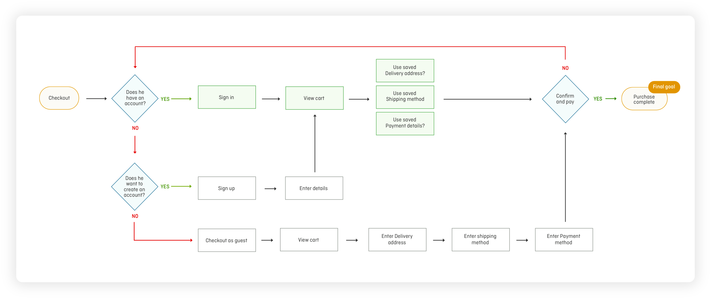
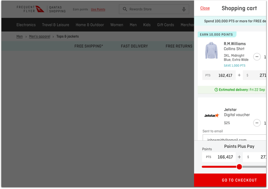
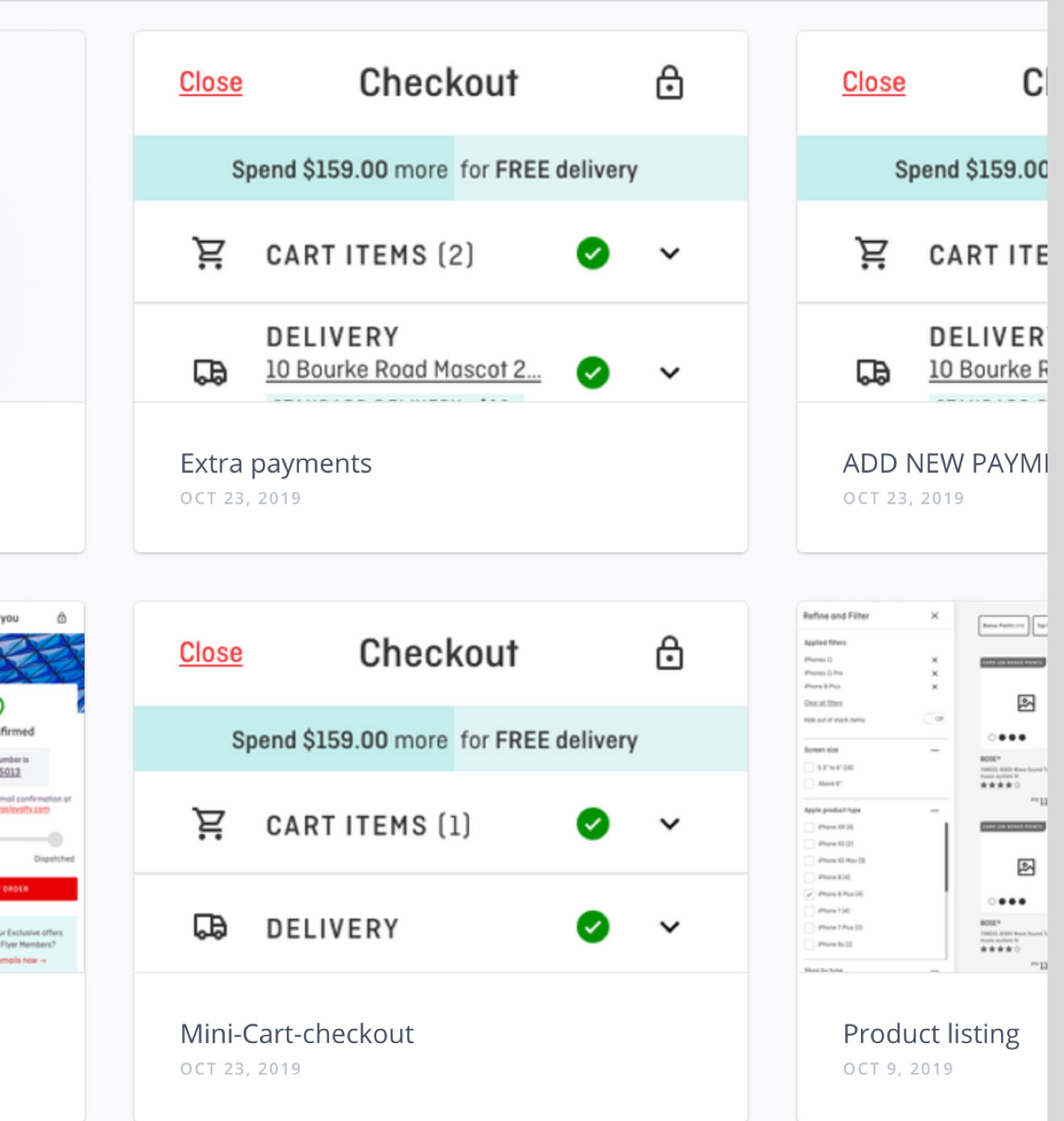
Checkout - end to end
Bianca Crammond - Persona User Flow
The first user persona I addressed in my user flows was Bianca Crammond. Bianca’s main goal was to search for a set of BOSE headphones to replace her old ones.
Bianca’s user flow (illustrated below) shows how she might go about searching for the BOSE headphones and the several different paths she might take to successfully purchase them.
Charles McShane - Persona User Flow
Both Bianca and Charles McShane wanted a super fast checkout experience, so it was important to cover this within the user flows. The flow below shows how Charles McShane accomplished his goal of buying a TV.
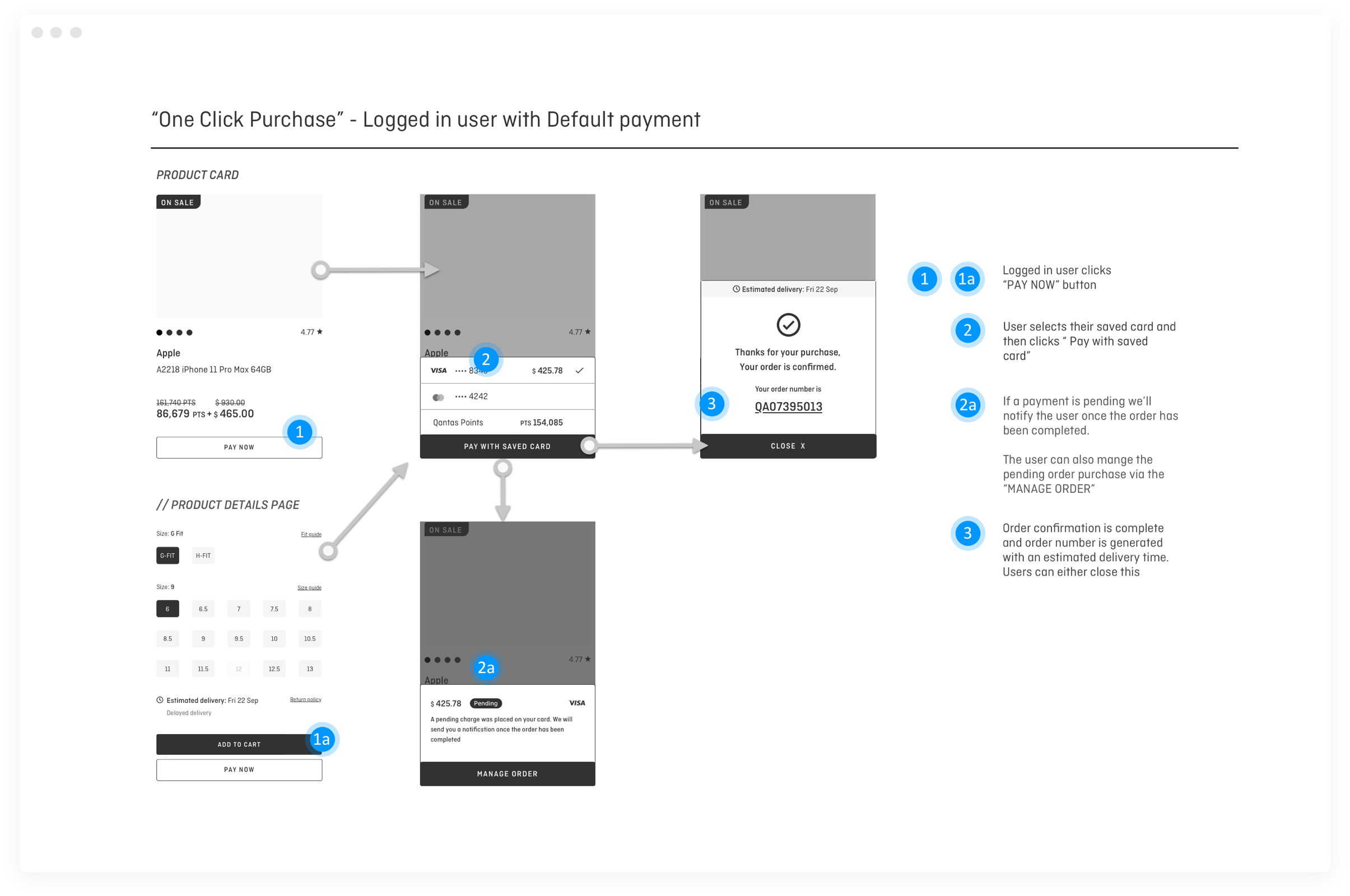
We wanted to minimise the steps Charles needed to take to complete the checkout process by allowing him to sign in to his account. This would automatically input Charles’s McShane checkout information for him to streamline the process and instanly checkout.
Wireframes
Once we created the user scenarios, I created a skeleton structure based on users primary goals.
Using the schemas above we were able to create general logic architecture that gave a big picture of the logic processes and required screens.
UI Design methods
-

Interface inventory
-

Concept mock up
-

User interface design
-

UI Trends benchmarking
-

Pattern Library
-

Styleguides
Interface inventory
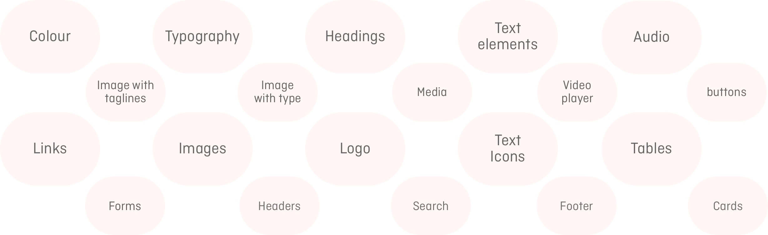
As I was redesigning an existing product, I created an interface inventory to map out all of the components — no matter how large or small — so that it was systematically documented. I also embarked on mapping out competitor’s product, undertaking an analysis of others work. This helped me to understand all of the different interface components that were going to need to be considered in the design.
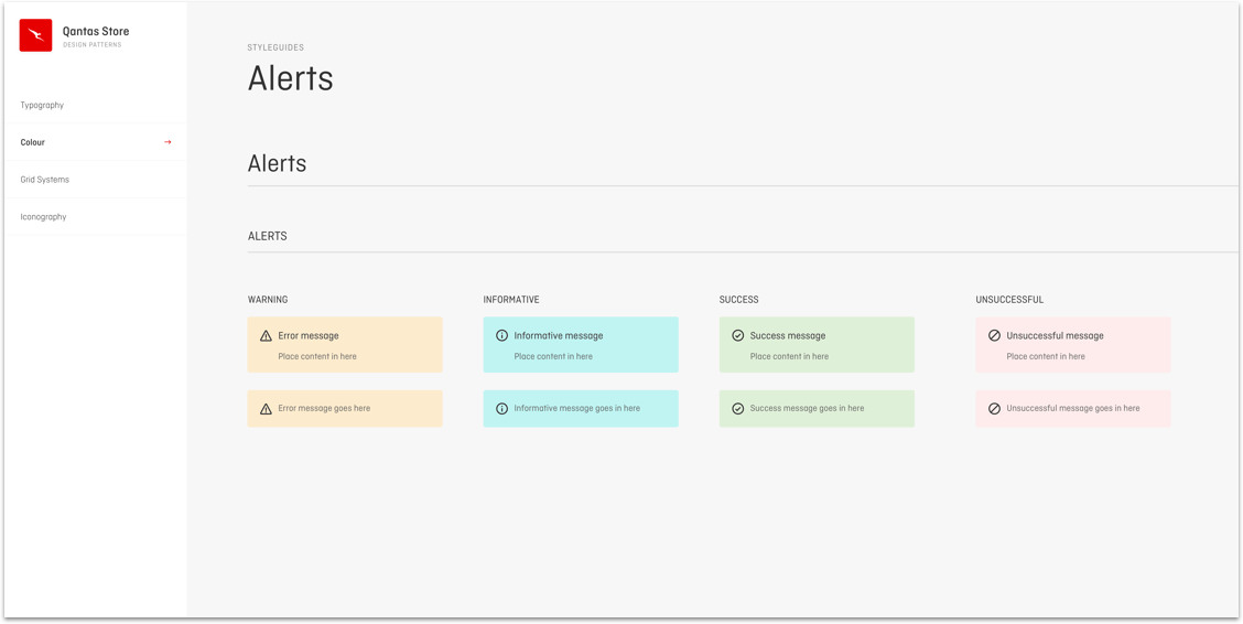
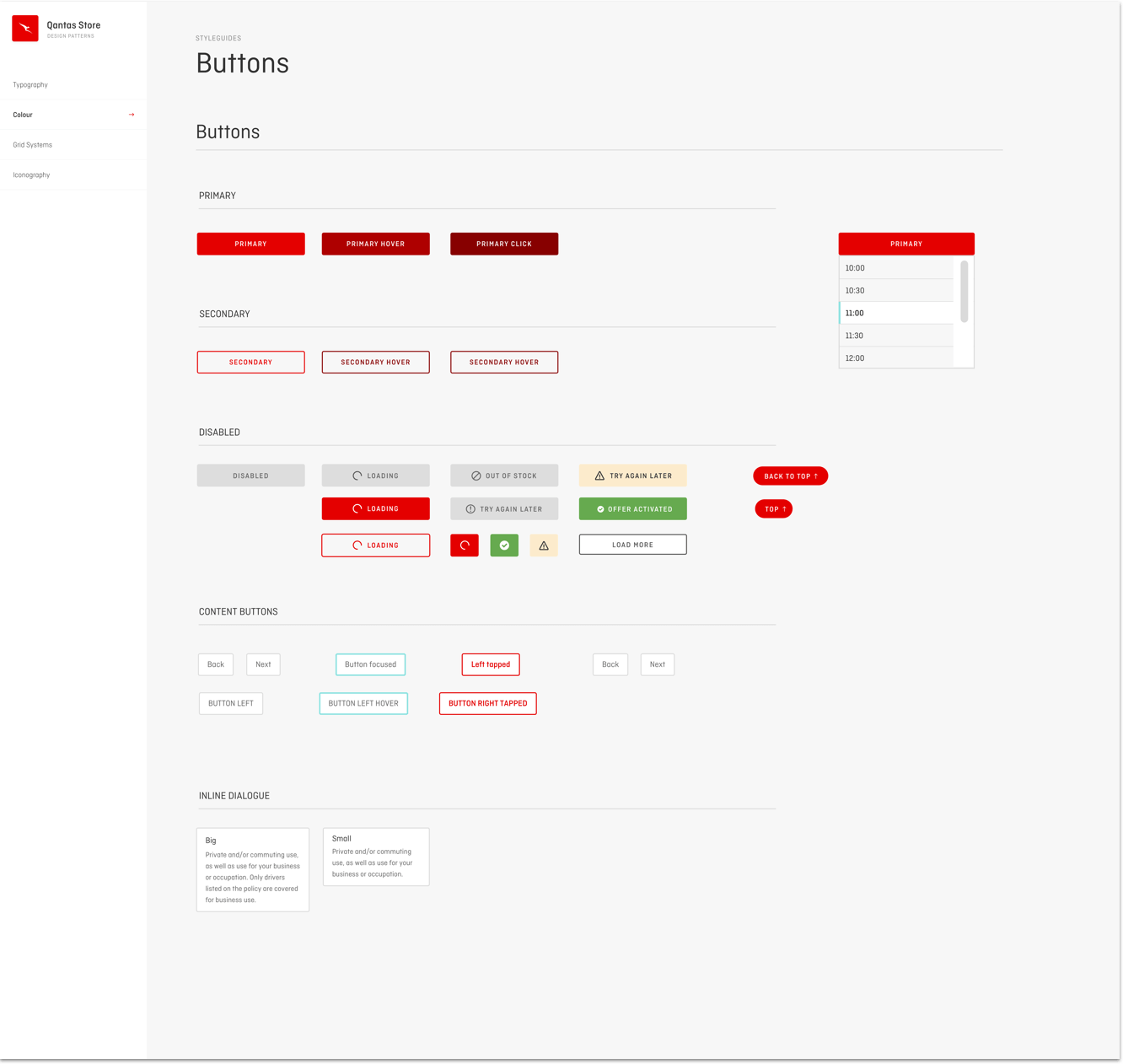
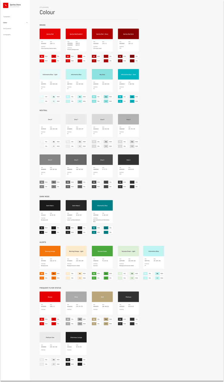
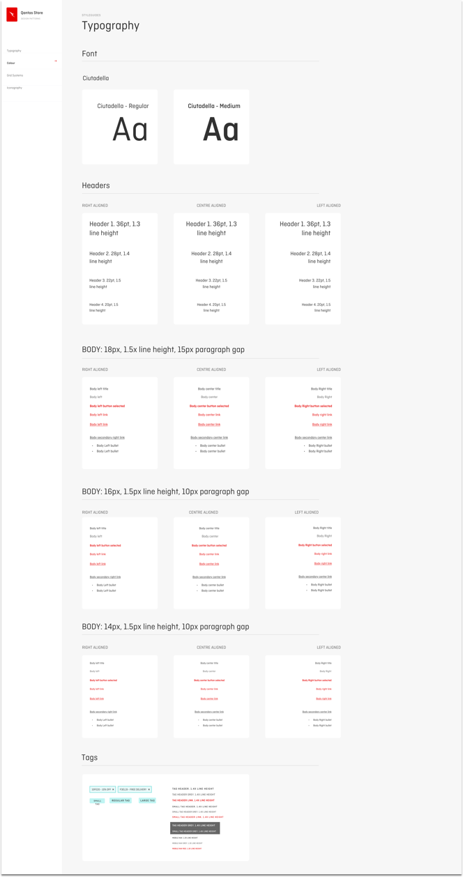
Pattern Library and styleguides
With the interface inventory undertaken and all of the components organised, it was important to identify common design patterns and build around these.
Referencing the Pattern Library and styleguides, I began to design interfaces starting with small components.
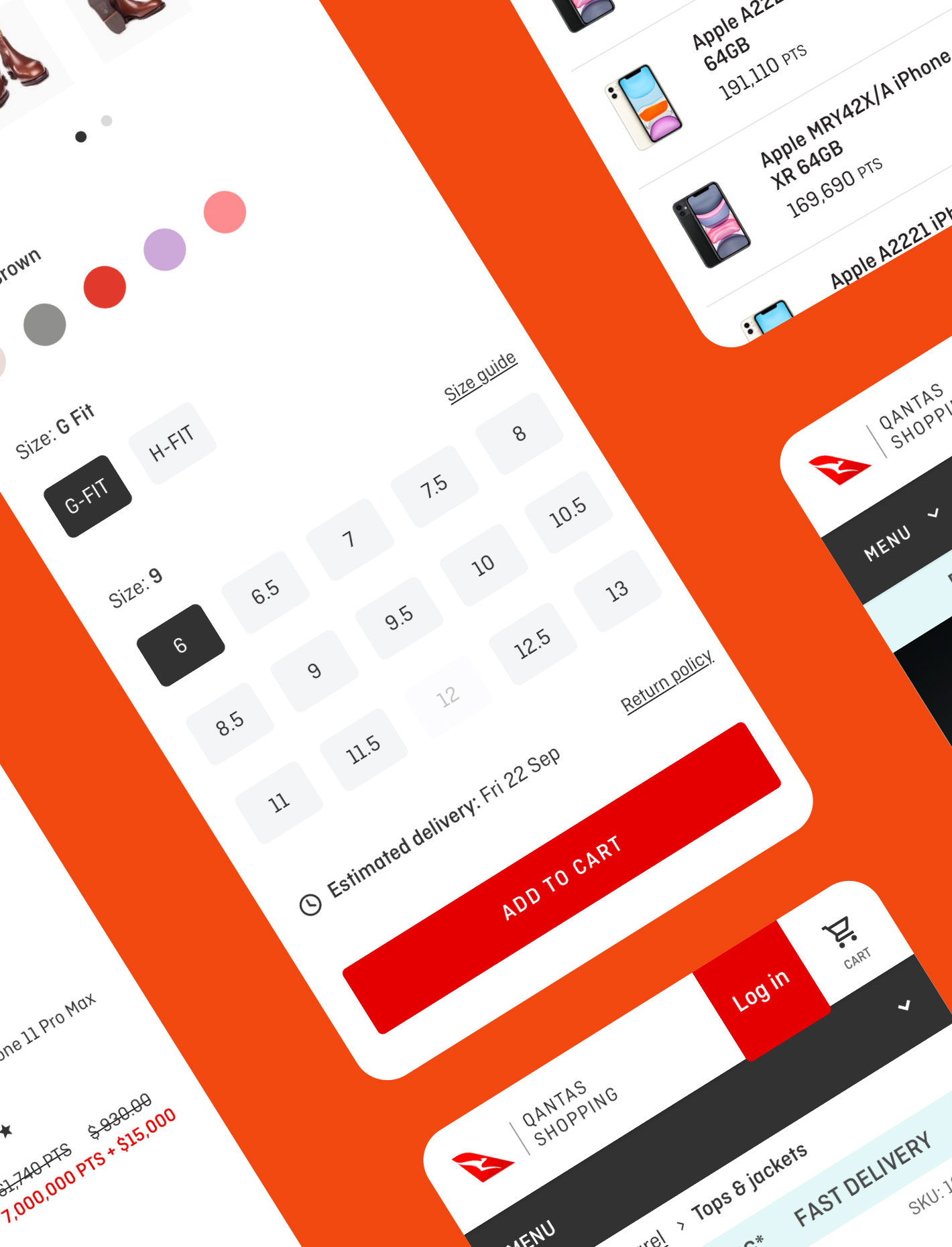
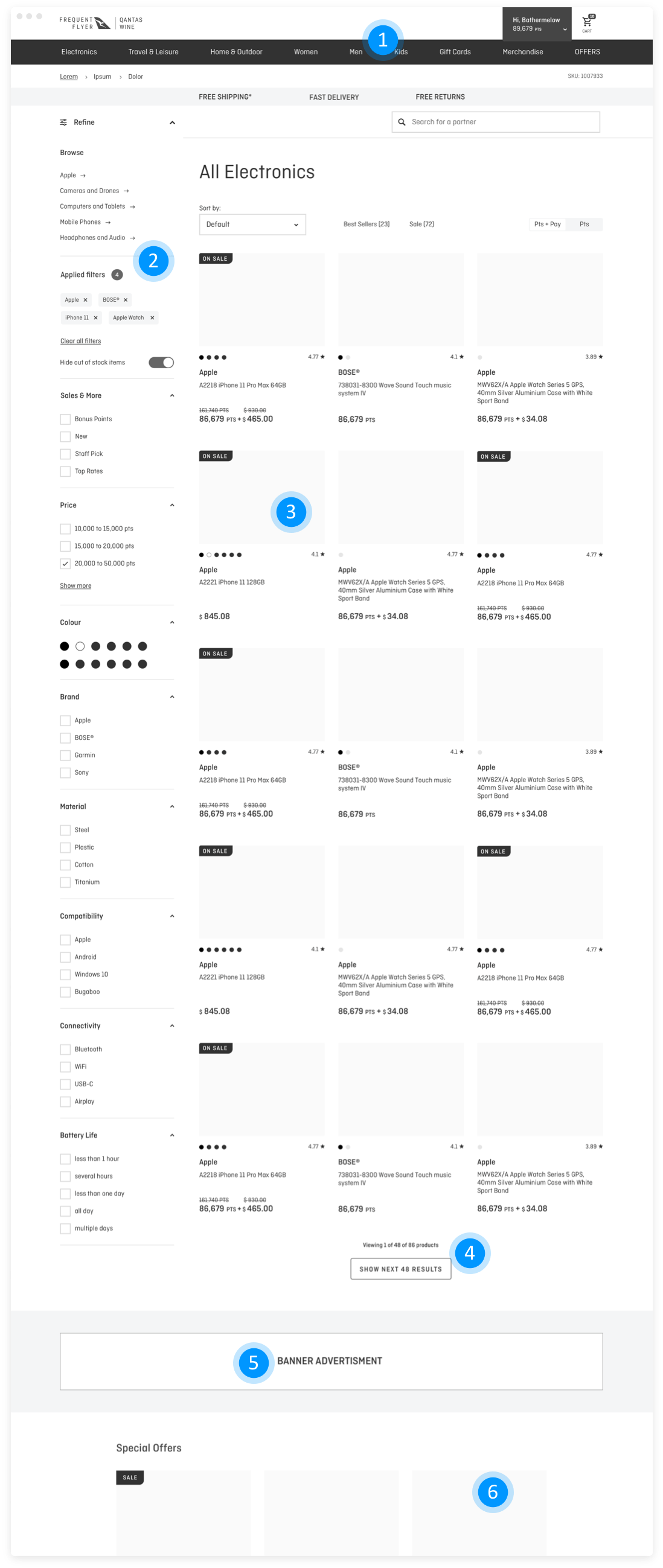
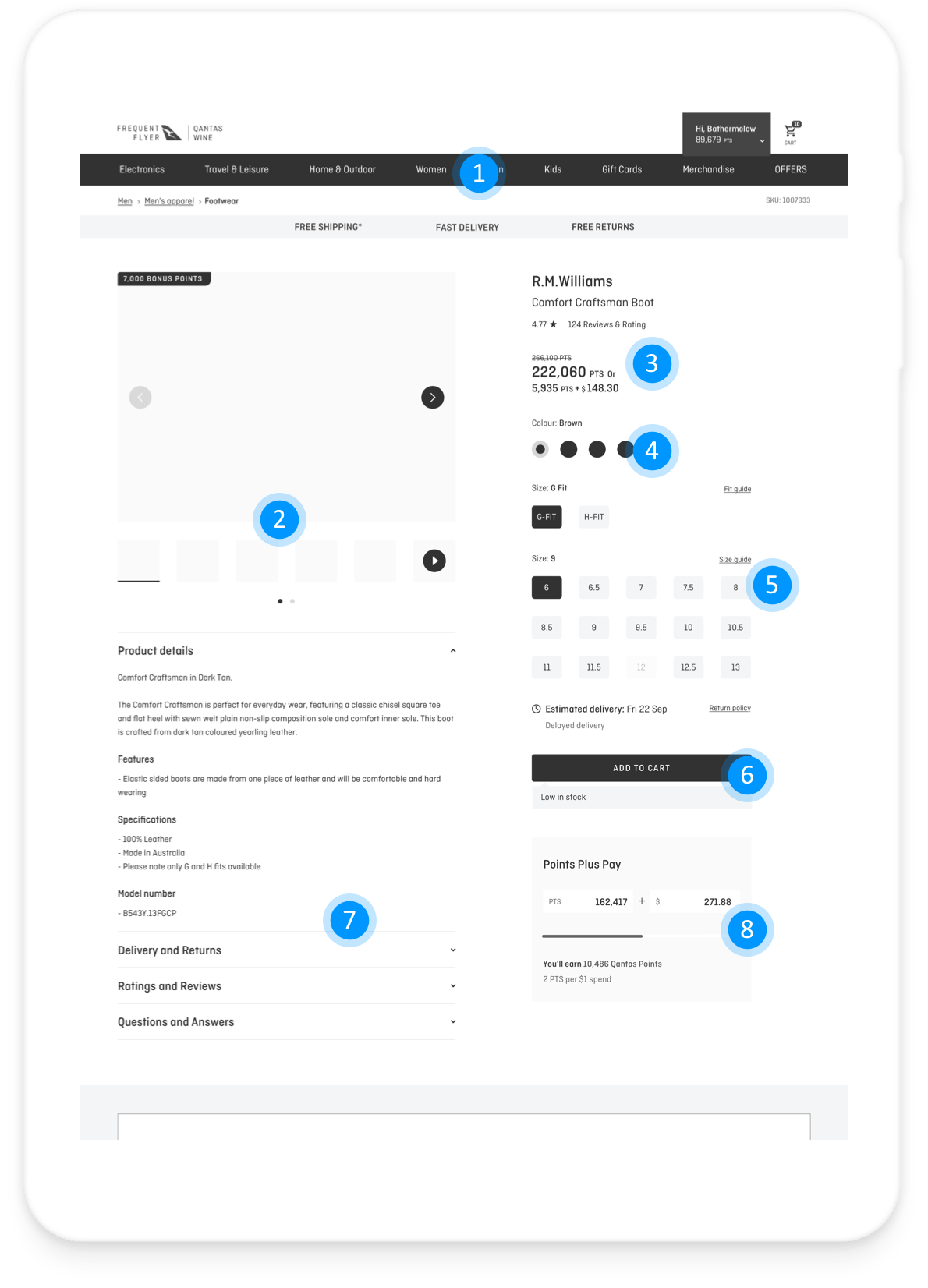
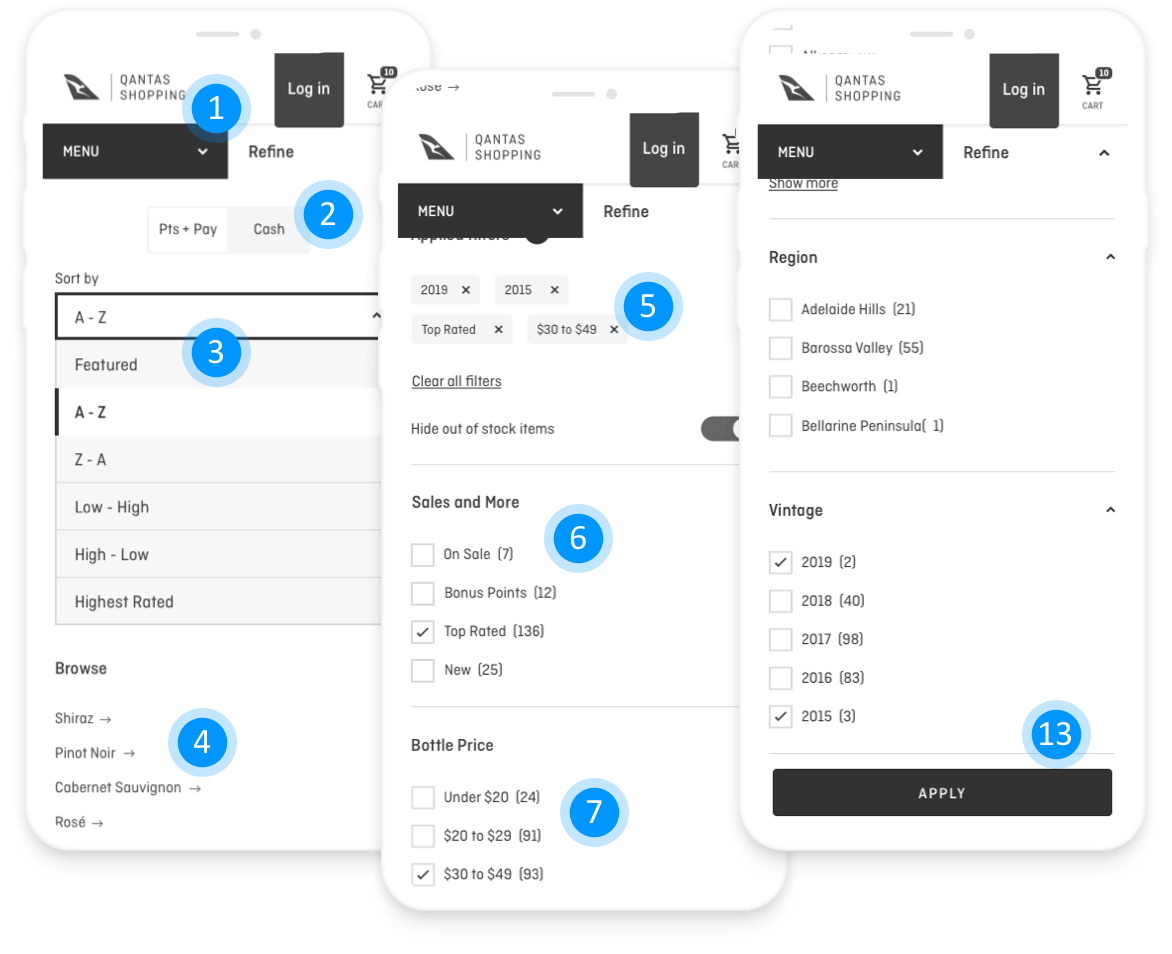
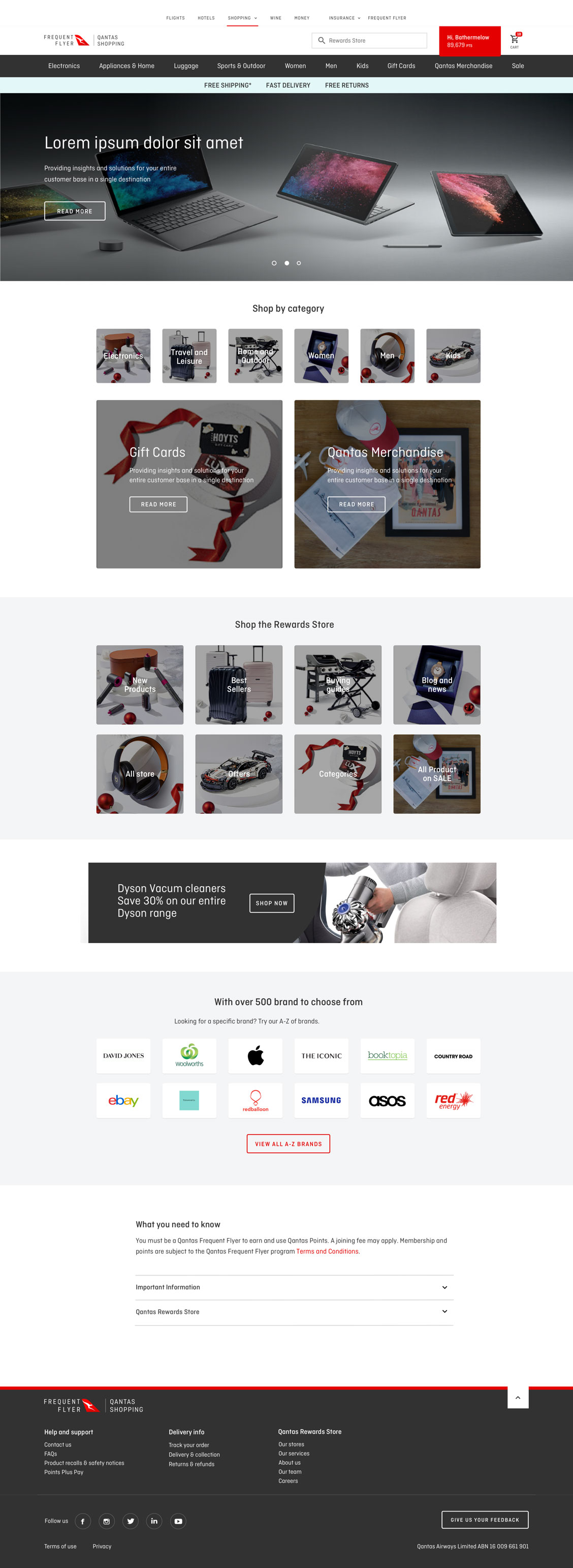
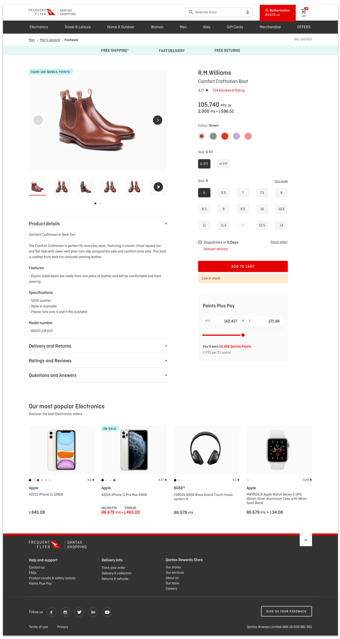
User Interface (UI)
The goal of the User Interface design was to focus on anticipating what users might need to do, ensuring that the interface had elements that were easy to access, easy to understand, and easy to use in order to facilitate those actions. The User Interface brought together concepts incl. interaction design, visual design, and information architecture.
By carefully thinking about and anticipating the goals users brought with them to the Rewards Store site, I created defaults that reduce the burden on the user. This became particularly important when it came to the checkout process where pre-chosen fields were filled out with members details, incl. credit card and delivery address for ‘one click checkout’.

Prototype and test methods
Here is an example of a prototype for Remember me log in
-

Collaborate with engineers on UX and UI
-

Usability testing
-

Micro interactions and animations
-

Design iteration of UI and UX
-
Built many feature Prototypes
-

Testing and iterated Prototypes
TESTIMONIALS
“ I want to thank Fred his assistance in helping prepare for, and then conducting our customer research. Fred was instrumental to the process. His work on designing concepts for how an improved checkout could be implemented, and then his preparation of prototypes to be used in the interviews allowed us to tease out the details and better communicate our ideas during the interviews. This research led to a change in the direction of our roadmap and was an invaluable exercise for Qantas! “Aaron Lum Head of Rewards Store
Qantas Rewards Store
“Fred has been working tirelessly towards the first Rewards Store redesign. His outputs to date has been fantastic and are keeping the team running at pace.”Matt Bodle Agile Business Analyst
Qantas Rewards Store
“ BIG thank you to Fred for jumping in on the Rewards Store replatform, he is a monumental driving force for this project and has continuously given up his whole weekend to get the UX/ UI into the great shape that it is today. Thank you so much Fred! “Kim Reynolds Digital Product Manager
Qantas Rewards Store