

Turn your online shopping into your next holiday.
Qantas Frequent Flyer is the loyalty program offered by Qantas airline. Qantas Frequent Flyers earn ‘points’ for shopping. These points can be redeemed for flights, accommodation, movie vouchers and even noise cancelling headphones to use during your next flight.
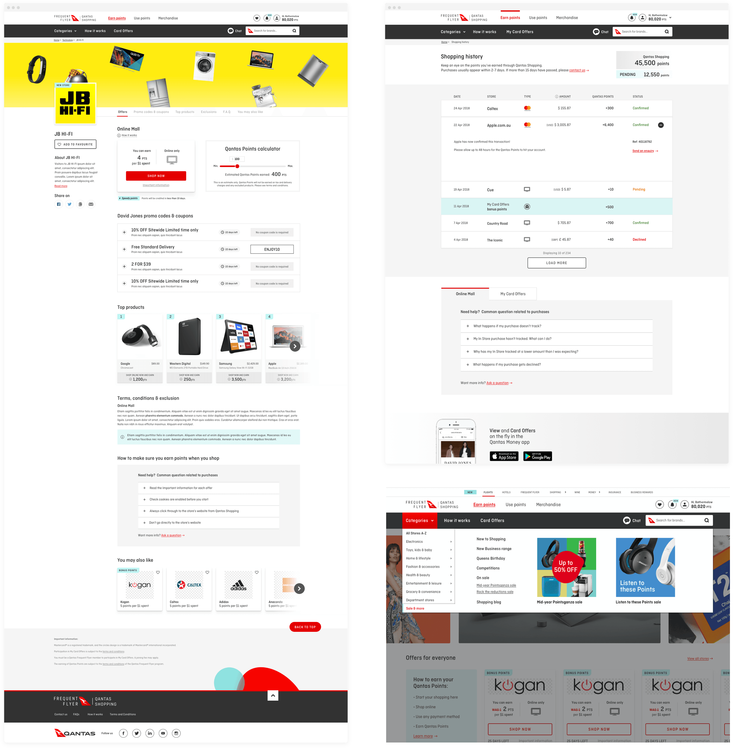
With over 970 different partner brands who offer Qantas Points to their customers, there was a need for a single destination where members could easily discover, or remember, where to find these points earning offers and opportunities.
While the primary goal was to create a brand new customer experience portal, the business also wanted to broaden its customer base to reach non-members whom had recently purchased with a Mastercard credit card.
And so, Qantas Shopping was born.
UX Research methods
-

Customer interviews to validaate hypothesis
-

Validate data & analytics vs requirements and constraints
-

Qualitative Surveys and Questionnaires
-

Proof of concept to validate hypothesis via rapid prototyping
-

Validated business hypothesis versus customer needs
-

Competitor analysis & competitive testing
Key focus areas
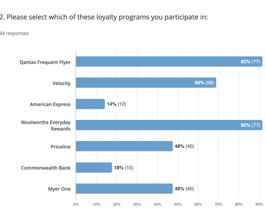
Qualitative survey
My research and customer interview goals were to test my assumption with my target audience, having recently purchased, or about to make a purchase, themselves. I investigated and discovered how they currently executed this.
To collect this information I created a discussion script guide and conducted three interviews, all sessions lasted 45-60 minutes.
I also analysed the current nature of customer complaints through the call centres and ‘Contact Us’ forms to further validate any anomalies.
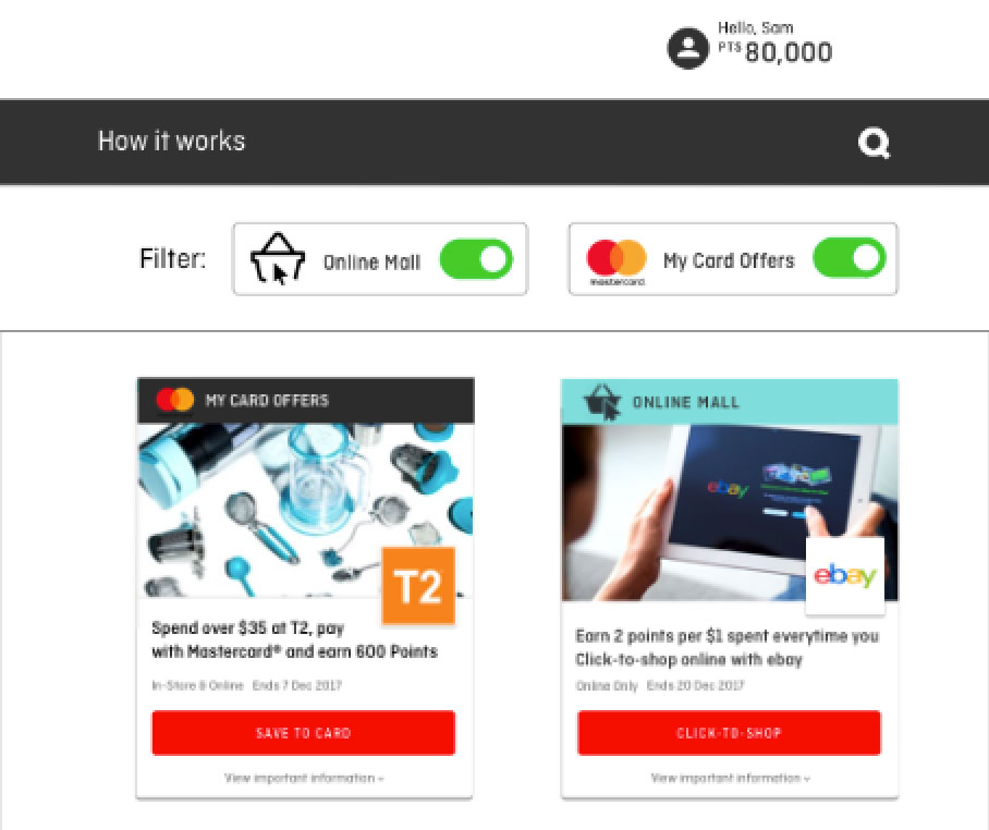
Proof of concept via rapid prototyping
I created a rapid prototype that visualised the vision. Paper and wireframe prototypes failed to effectively present the concepts, as interviewees didn't understanding the value of partner offers, or why they needed to link their Mastercard credit card in order to be eligible.
The POC further helped me to validate the concept’s challenges and limitations back to the business.
UX Design methods
-

Created User Stories and Personas
-

Competitive and task analysis
-

Facilitated ideation workshop using “How might we”
-

Created User Flows
-

Hand Sketches and Wireframes
-

Card sorting exercise
What customer problem am I solving for?
“How might we enagage customers via intresting and exciting offers?”
Card and tree sorting
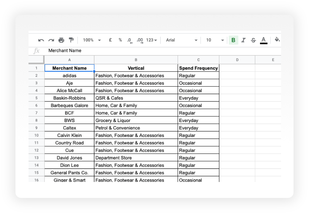
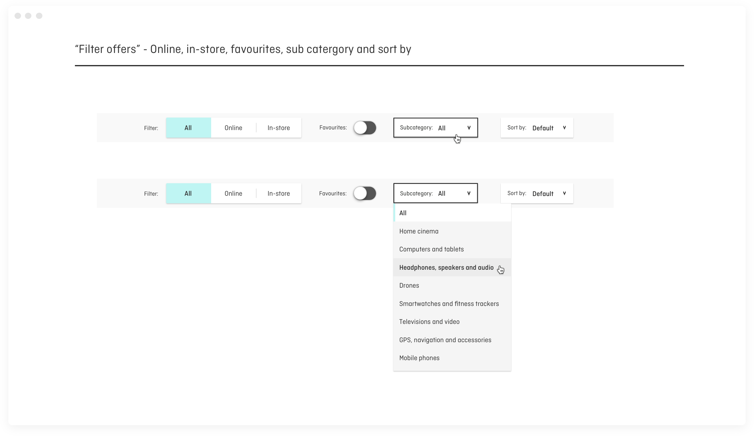
I asked 6 participants to organise around 296 different brands titles into categories that seemed the most logical to them. I then asked them to label each of the groups with titles that they felt accurately described the items within the category.
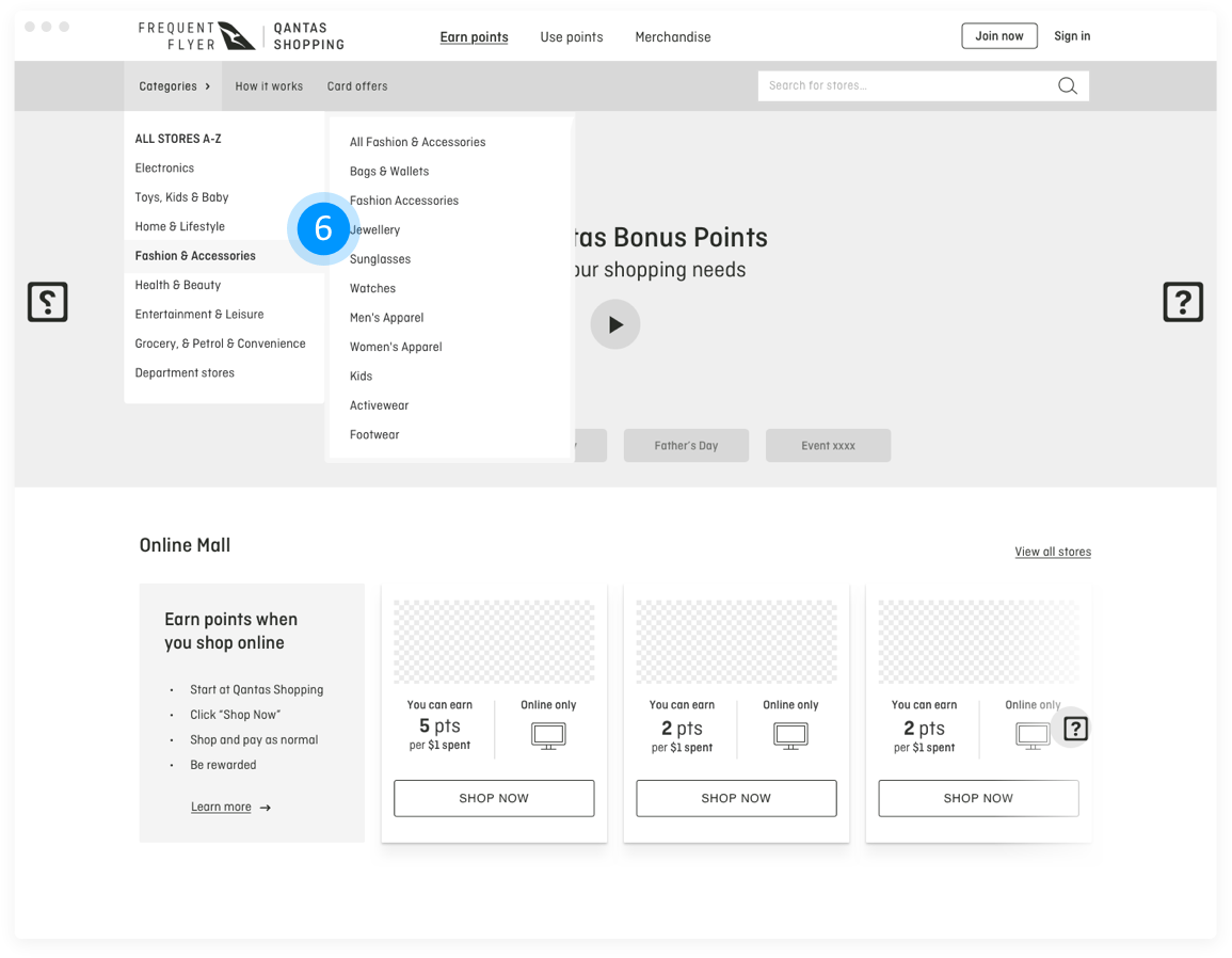
This helped me to understand what users' expected, to design the structure of the website, to decide what to put on the homepage, how to label categories and navigation.
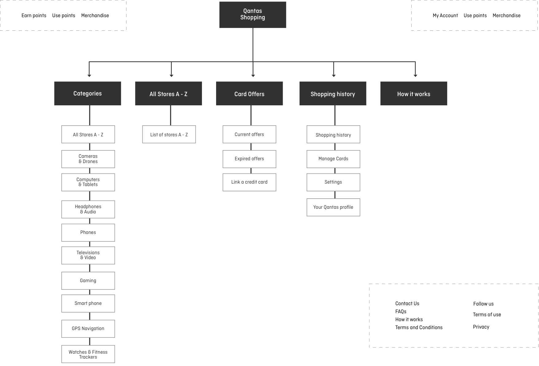
I conducted a tree sort where a group of 18 different participants were asked to sort navigational items into predetermined categories. This helped clarify a logical and understandable navigation for the the majority of users.
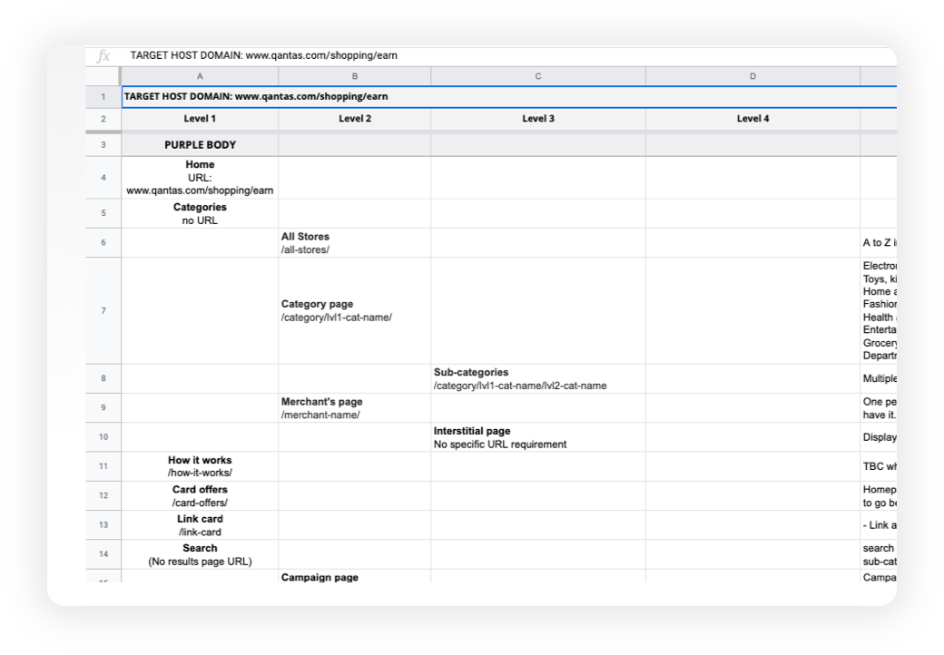
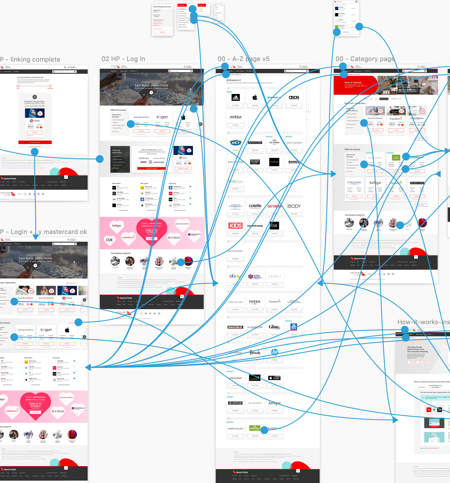
Sitemap
Once brands titles were organised into categories, I set out to create a site map to help define the overall structure of the site. This helped place products into logical categories where users would expect to find them when visiting the website and helped me make the experience more intuitive.
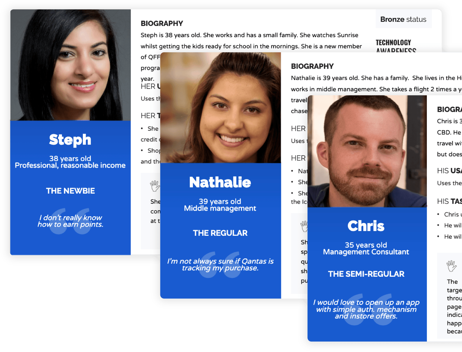
User Persona
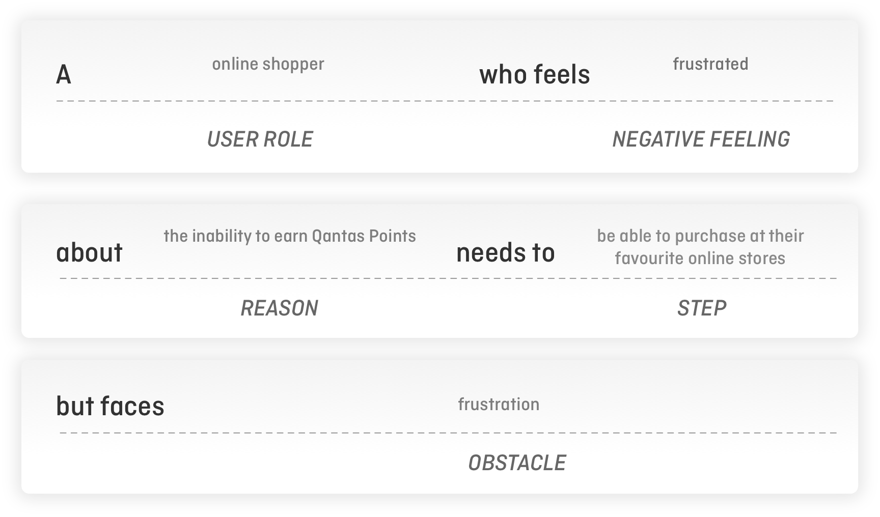
From the customer interviews, personas (The Newbie, The Regular and The Semi-Regular) were created to help further understand the customer’s goals and what their frustrations were.
User Stories
Once personas were created I quickly assembled the personas motivations and goals. These were created via ‘User Stories’ which allowed me to view a bare structure of the personas primary goals.

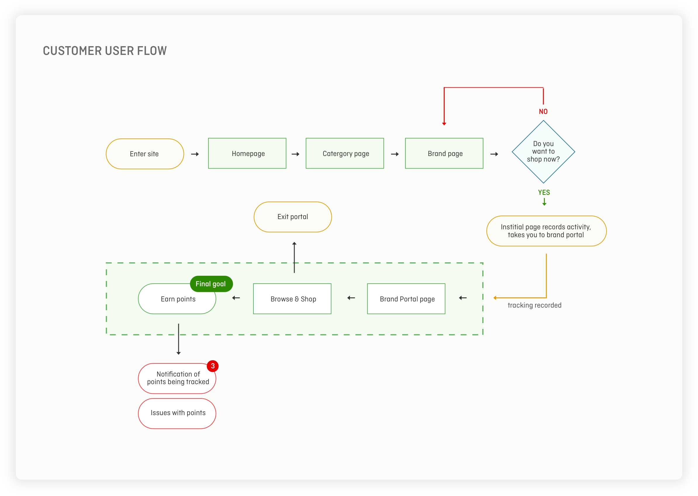
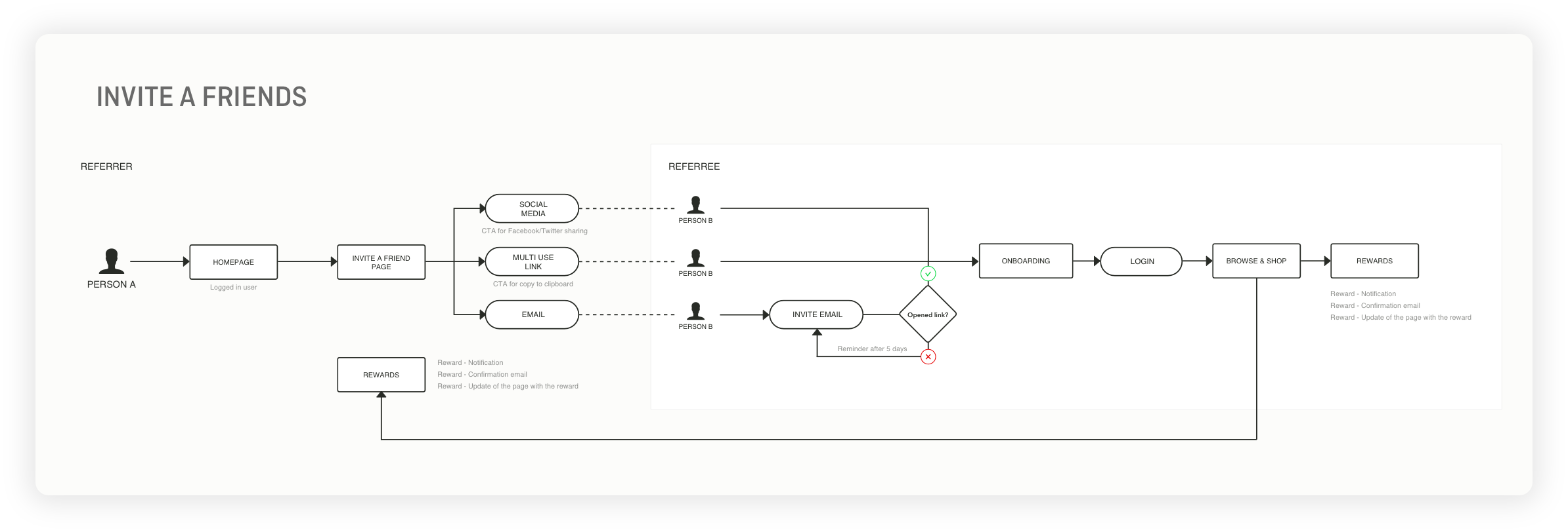
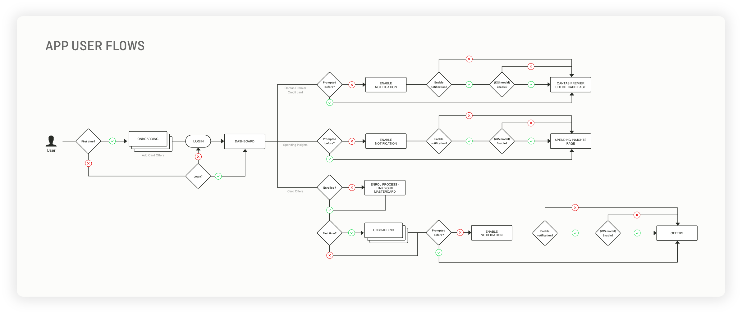
User Flows
With the information architecture created, I used this to then look at the User Flow to action goals of both the sender and recipient of the parcels.
It helped me further understand and validate the pain points of the recipient and the sender - both were left in the dark due to a lack of transparency and information once the delivery was in ‘transit’.
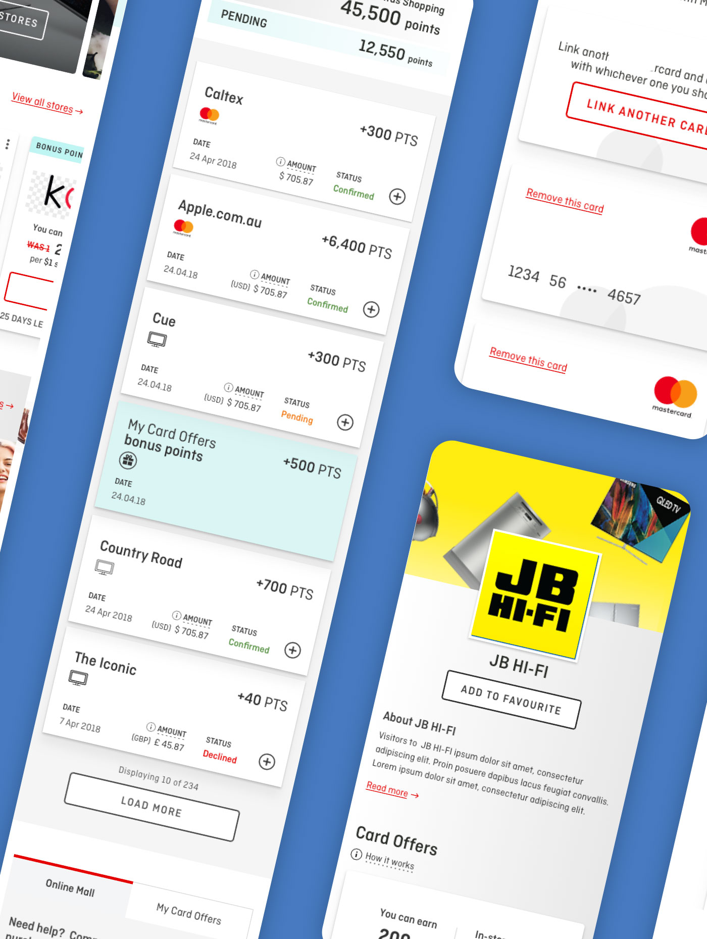
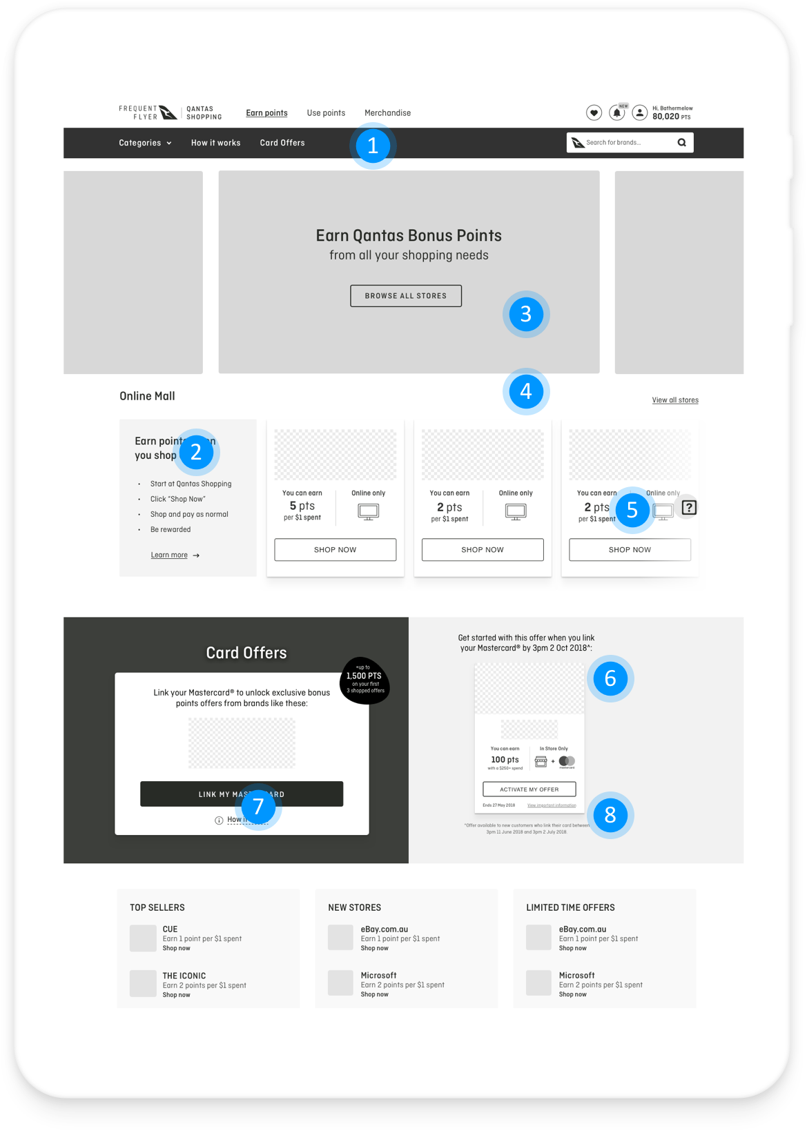
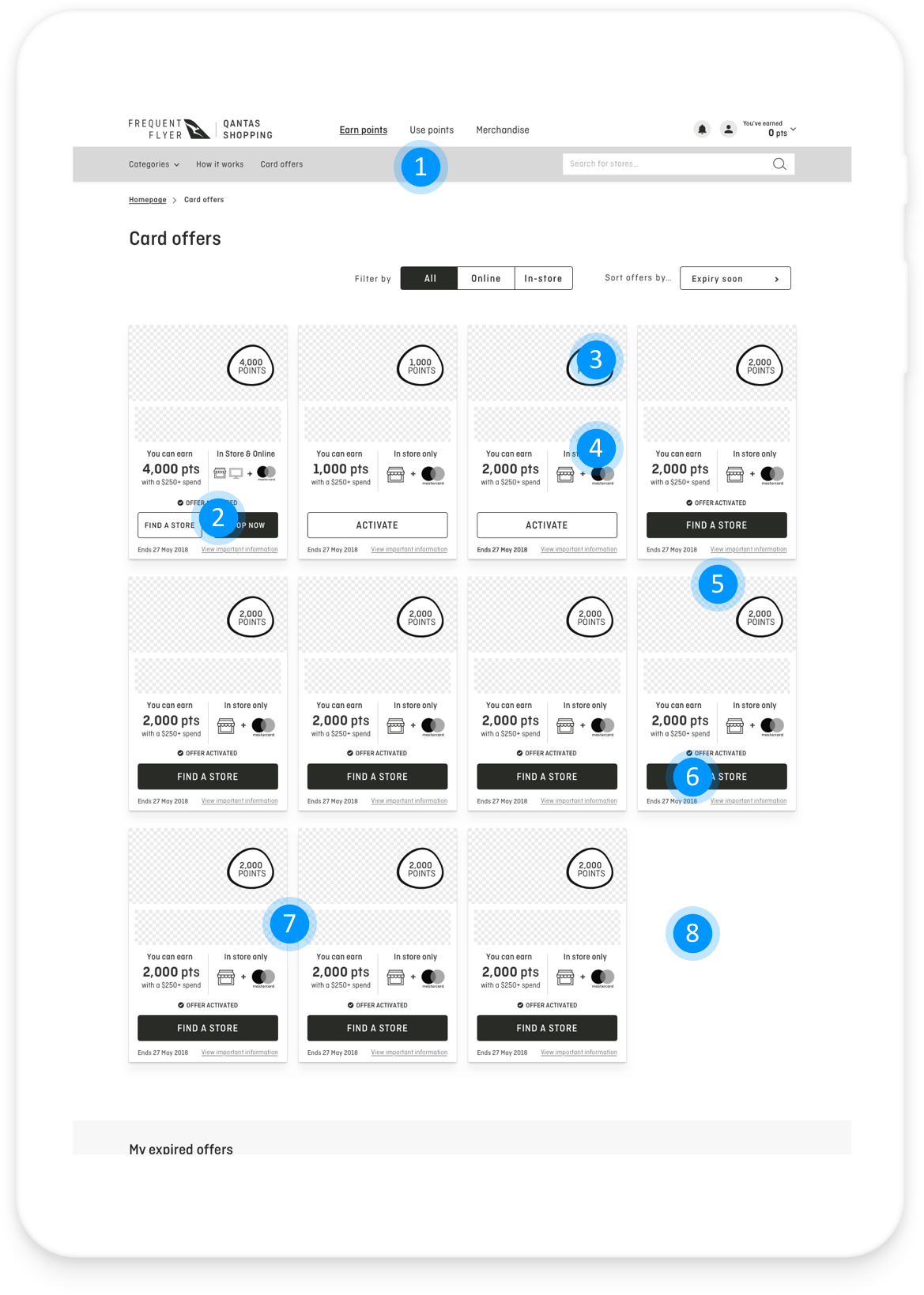
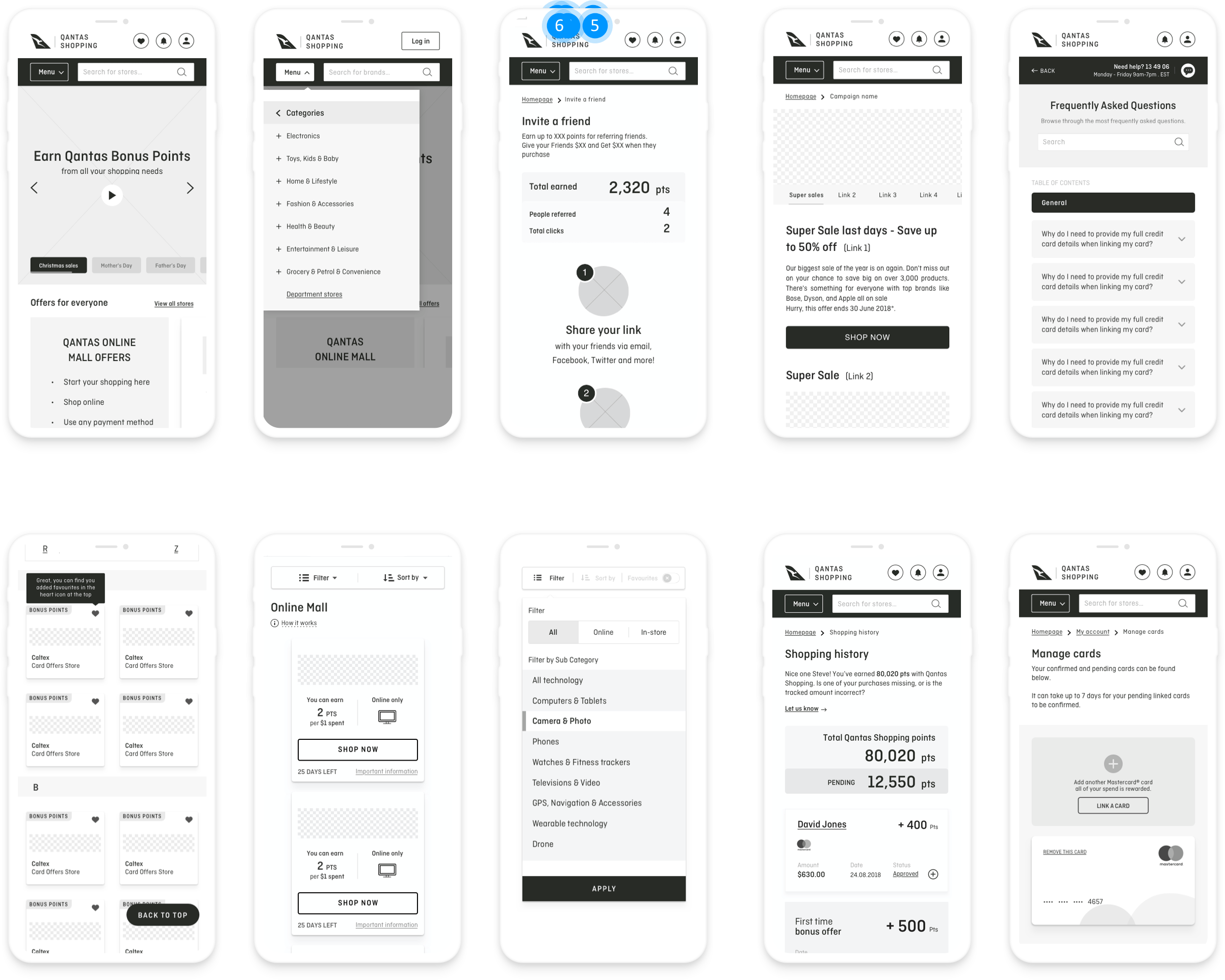
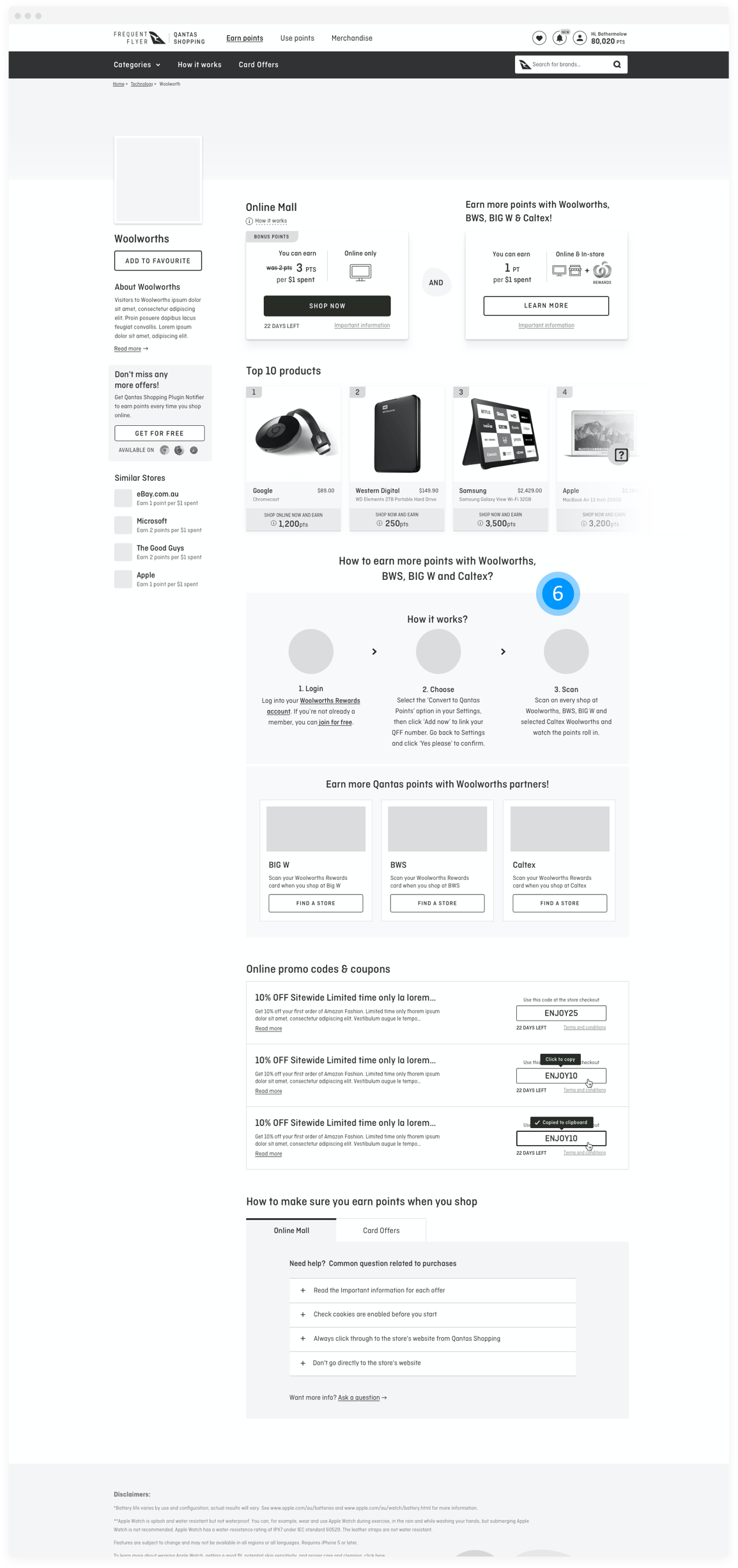
Wireframes
After many rounds of iterations and design reviews, I started to create the wireframes which were based on final feedback from stakeholders, Product Owners and the team.
UI Design methods
-

Interface inventory and User interface design
-

Concept mock up
-

Prototype building and testing
-

UI Trends benchmarking
-

Micro interactions and animation
-

Pattern Library and styleguides
Interface inventory
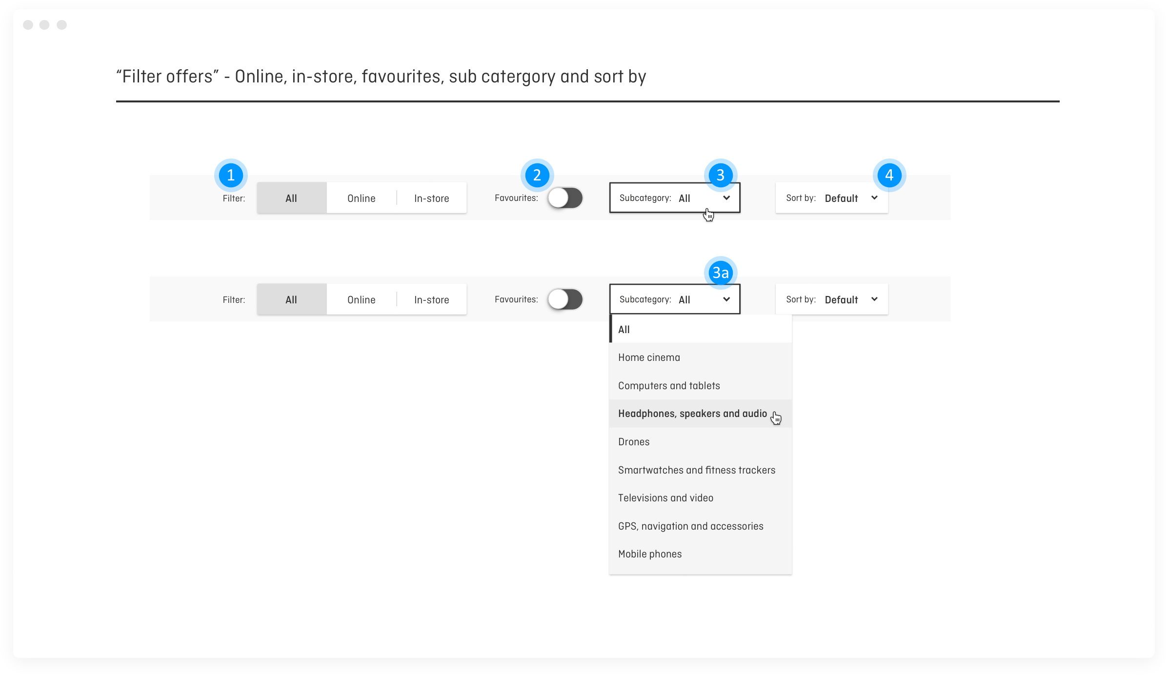
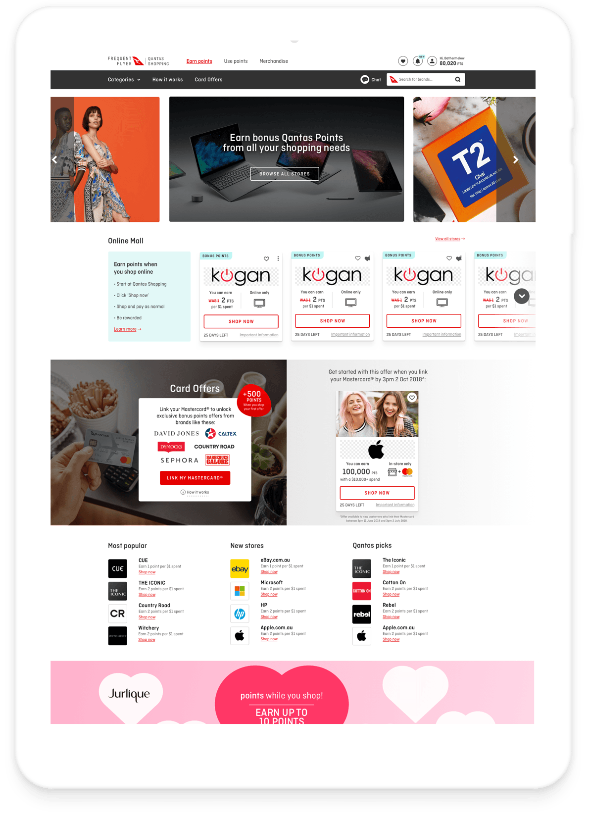
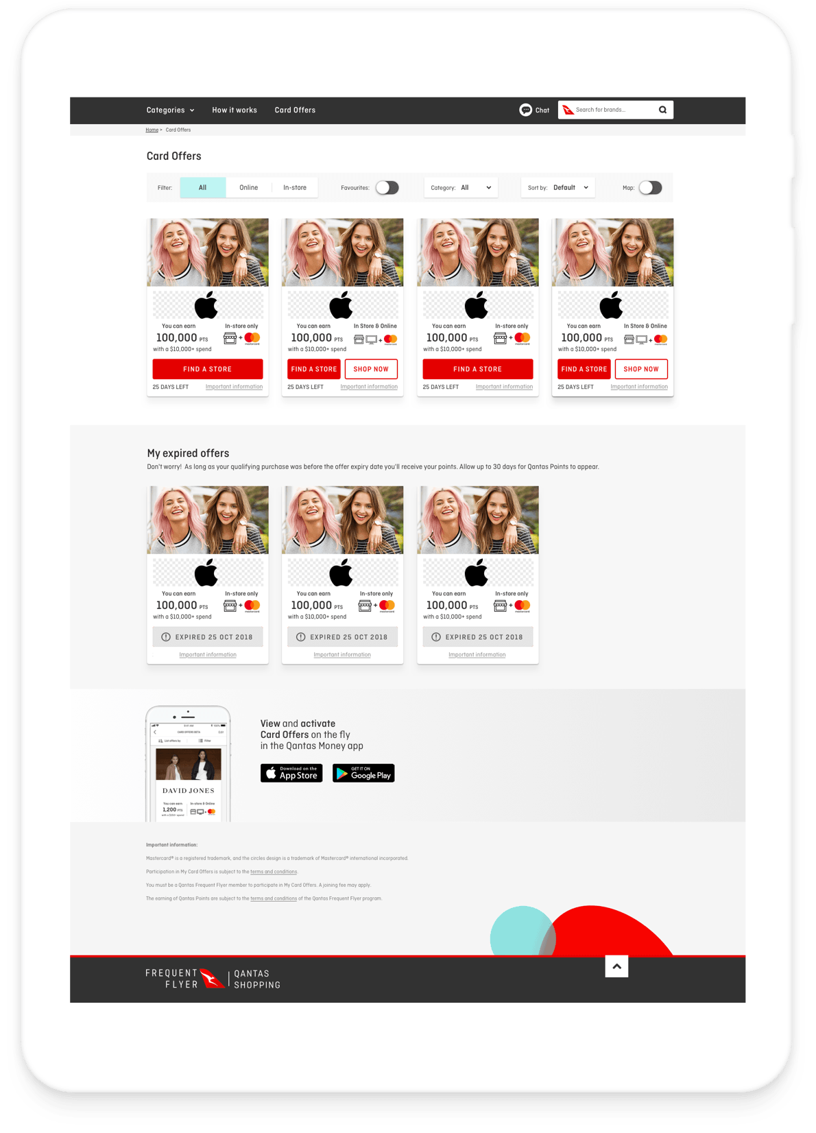
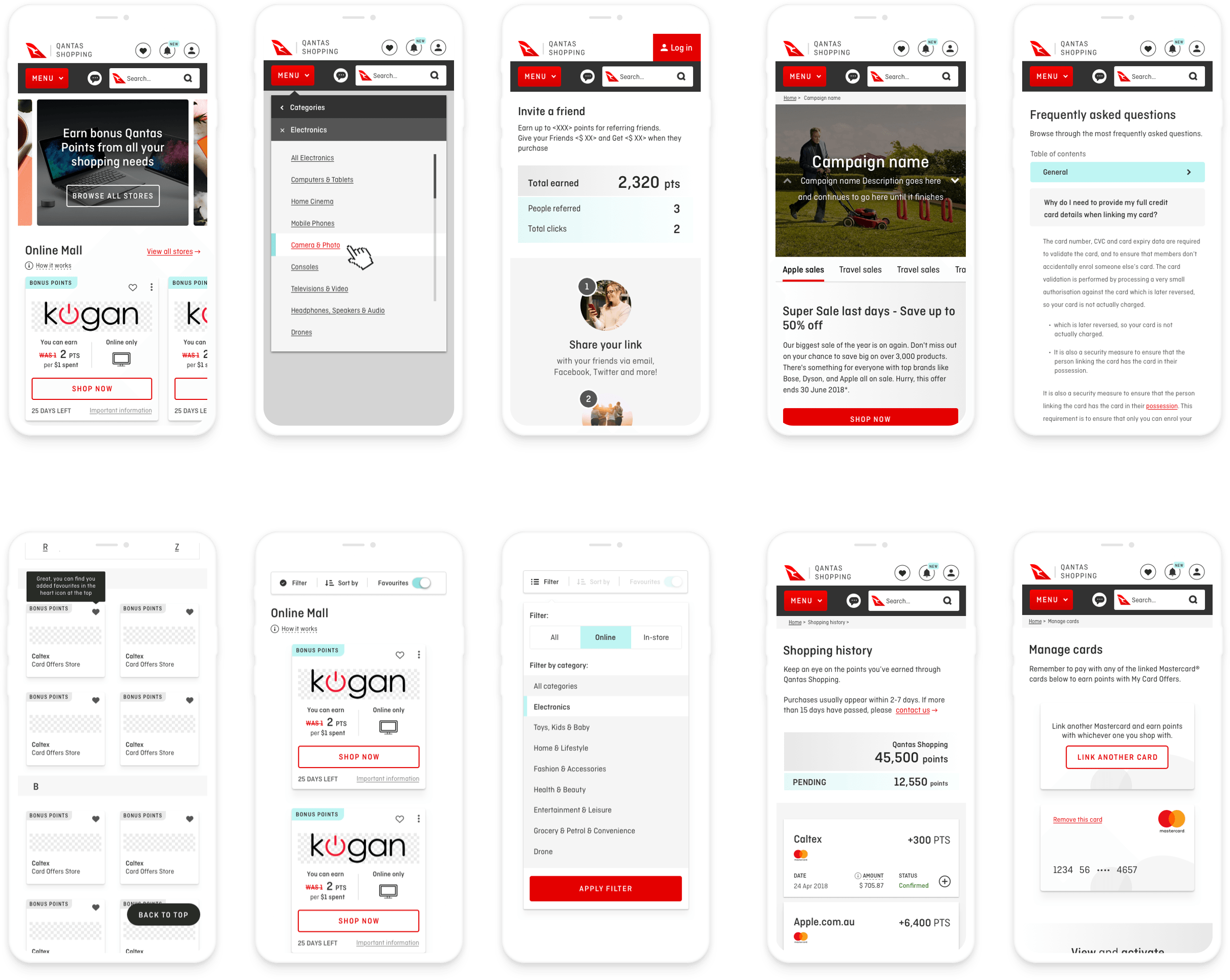
I created an interface inventory to map out all of the components — no matter how large or small — so that it was systematically documented. I also embarked on mapping out competitor’s product, undertaking an analysis of others work. This helped me to understand all of the different interface components that were going to need to be considered in the design.
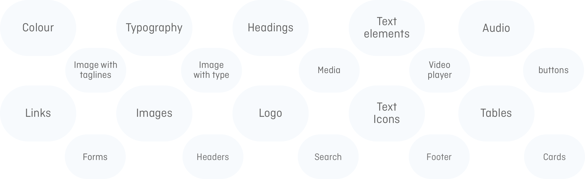
Pattern Library and styleguides
With the interface inventory undertaken and all of the components organised, it was important to identify common design patterns and build around these.
Referencing the Pattern Library and styleguides, I began to design interfaces starting with small components.
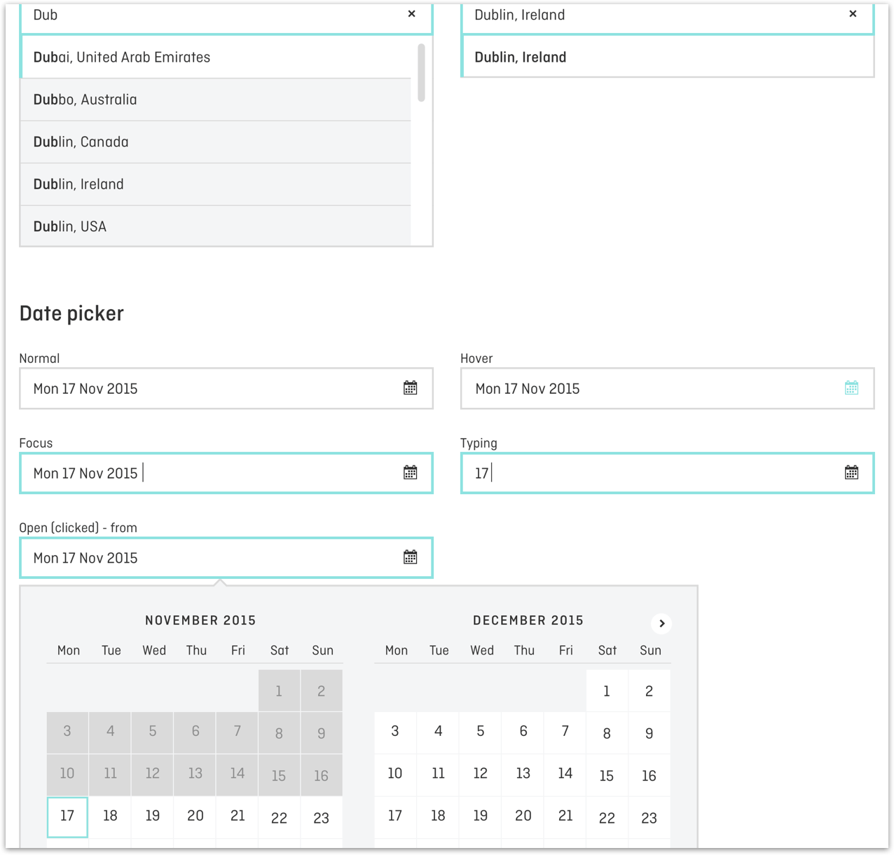
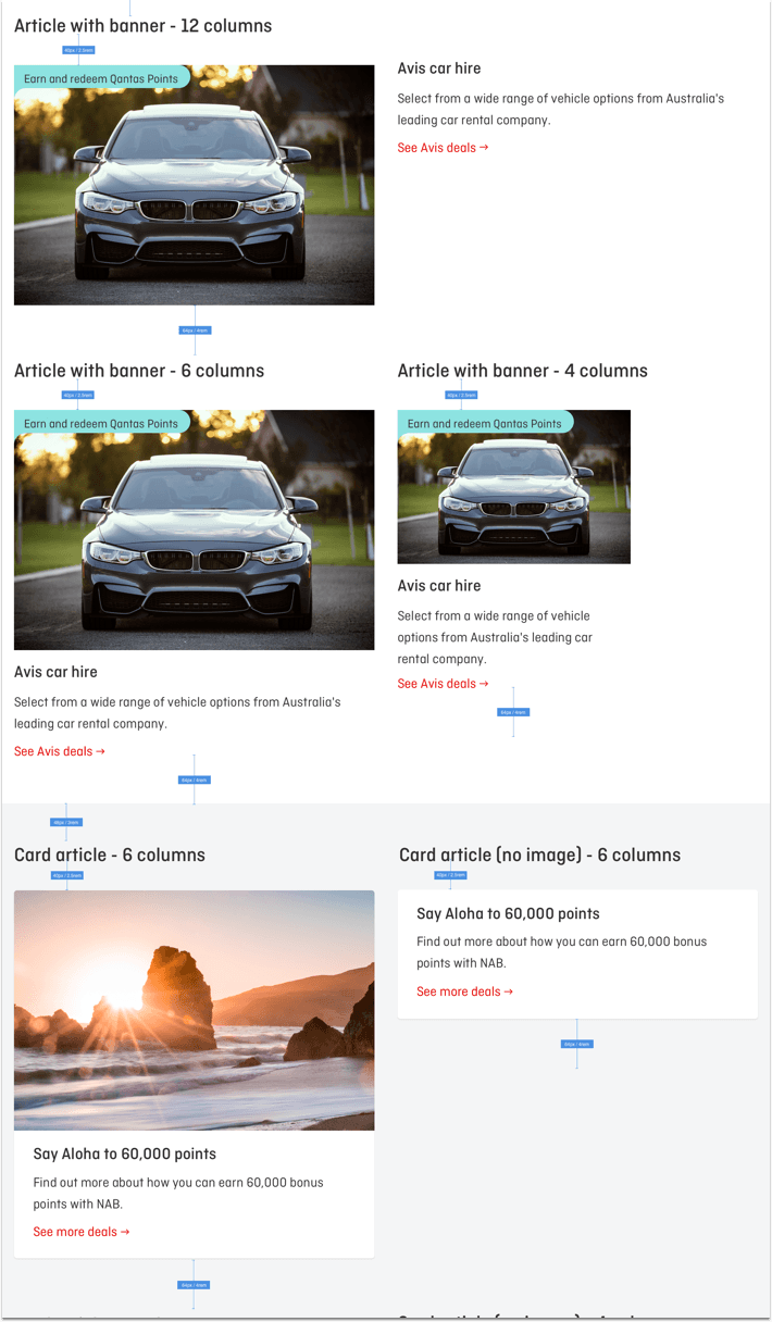
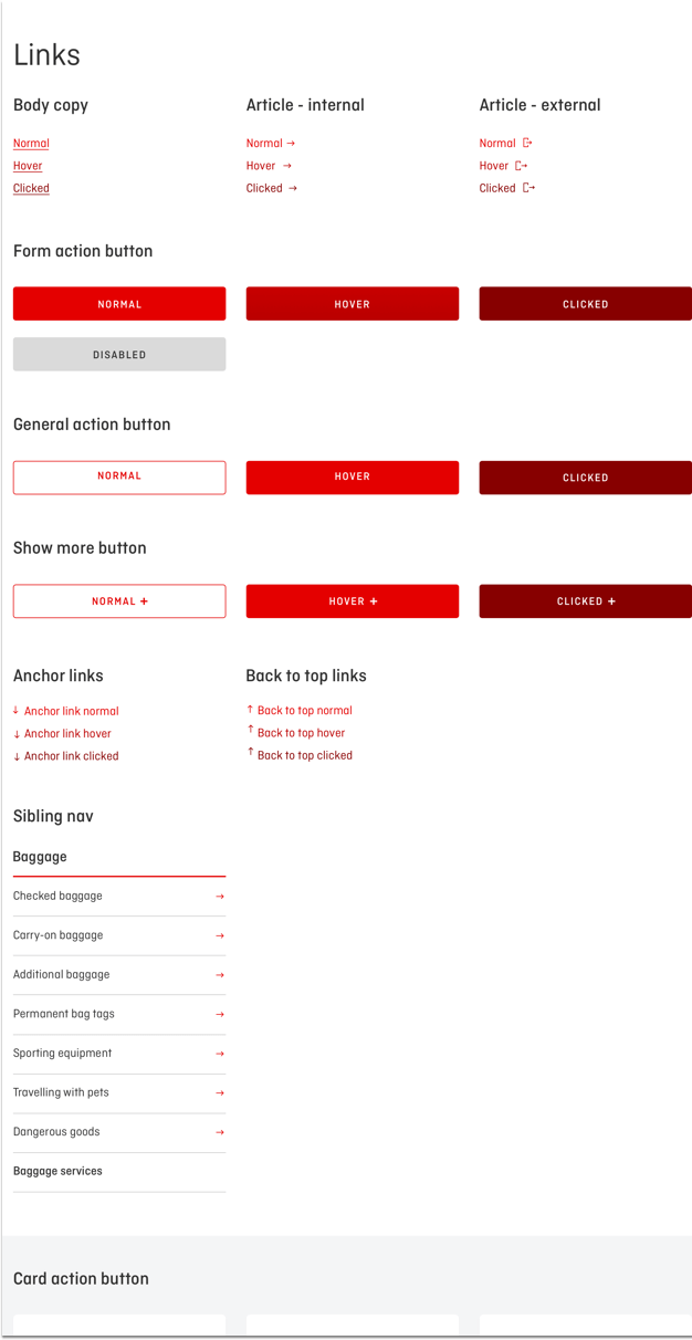
User Interface (UI)
By carefully thinking about and anticipating the goals users brought with them to the site, I created defaults that reduced the burden on the user.
Prototype and test methods
Due to the fact that I’ve signed an NDA, I can only show one link / example of the work. Due to user and interviewee privacy usability testing cannot be shown.
-

Collaborate with external provider on build, UX and UI
-

Usability testing
-

Micro interactions and animations
-

Design iteration of UI and UX
-
Built many feature Prototypes
-

Testing and iterated Prototypes
TESTIMONIALS
“ Fred has provided a consistently high level of Ux service to Qantas Shopping over a sustained period of time including implementation of one click purchase, Mini cart express, managing Ux issues and delivering month-on end results within challenging timeframes. Without his on-going support, we would not be able to complete our own deliverables. Thank you Fred! “Janet Bailey Head of Retail
Qantas Shopping
“ Fred consistently goes above and beyond in his day-to-day work. Nothing is ever a problem. He just gets it and gets the work done at a super fast rate!”Lilly Fong Agile Business Analyst
Qantas Shopping
“ Fred is an all round super “Product Designer” star! the best I have ever had the privilege of working with. We are so lucky have him on this project”Alex Evans Digital Product Manager
Qantas Shopping